Design comparison
Community feedback
- @HassiaiPosted about 2 years ago
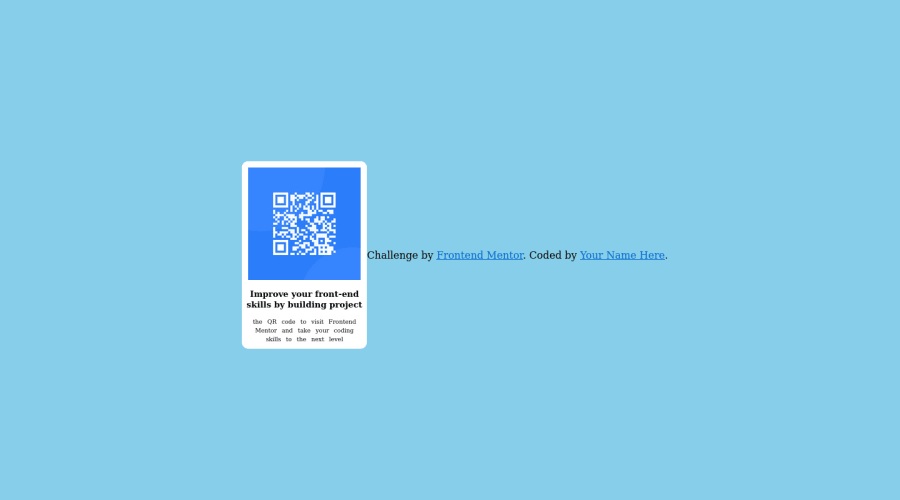
Replace <div class="qr-box"> with the main tag, <h5> with <h1> and <div class="attribution"> with the footer tag to fix the accessibility issues. click here for more on web-accessibility and semantic html
Give h1 and p the same font-size of 15px which is 0.9375rem, text-align: center, the same margin-left, margin-right and margin-top values. Give p a margin bottom value.
To center .qr-box on the page using flexbox, replace the height in the body with min-height: 100vh and add flex-direction: column so that the attribution will be below the div.
The body has a wrong background-color, give it a background-color of light-gray. Use the colors that were given in the styleguide.md found in the zip folder you downloaded.
For a responsive content, replace the width in .qr-box with max-width, increase its value and replace the height with a padding value for all the sides.
max-width:320px padding: 16px. Give the img a max-width of 100% and border-radius value, the rest are not needed.Use relative units like rem or em as unit for the padding, margin, width values and preferably rem for the font-size values, instead of using px which is an absolute unit. For more on CSS units Click here
Hope am helpful.
Well done for completing this challenge. HAPPY CODING
0@oluwakemiePosted about 2 years ago@Hassiai I just applied them Thank you You were really helpful
0 - @SoniBasantPosted about 2 years ago
Use "flex-direction: column" in body. So your name and QR code will be at center.
Use font style and background color as given in the style-guide.
Use border radius in image of QR code.
Other than that your project is good. With my suggestions, your project will look really good.
Good Luck. : )
0
Please log in to post a comment
Log in with GitHubJoin our Discord community
Join thousands of Frontend Mentor community members taking the challenges, sharing resources, helping each other, and chatting about all things front-end!
Join our Discord
