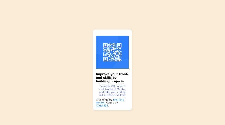
Design comparison
Solution retrospective
Any feedback on the QR code component to help me improve
Community feedback
- @HassiaiPosted almost 2 years ago
You forgot to add a closing tag of the first div to the html. Replace<div class="component">with the main tag, <h3> with <h1> and <div class="attribution"> with the footer tag to fix the accessibility issues. click here for more on web-accessibility and semantic html
The body has a wrong background-color. Use the colors and font-family that were given in the styleguide.md found in the zip folder you downloaded. You can find the font-family on google fonts.
This challenge does not require a box-shadow.
Increase the width of .component for it to be equivalent the width of the design.
width: 360px. There is no need to give .component and the img margin values.Give h1 and p a text- align: center, the same font-size of 15px, the same margin-left, margin-right and margin-top values. Give p a margin-bottom value.
Use relative units like rem or em as unit for the padding, margin, width values and preferably rem for the font-size values, instead of using px which is an absolute unit. For more on CSS units Click here
Hope am helpful.
Well done for completing this challenge. HAPPY CODING
Marked as helpful0
Please log in to post a comment
Log in with GitHubJoin our Discord community
Join thousands of Frontend Mentor community members taking the challenges, sharing resources, helping each other, and chatting about all things front-end!
Join our Discord
