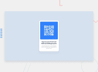
Design comparison
SolutionDesign
Community feedback
- @Fitsos17Posted over 2 years ago
Hello mate, your solutions is very close and I like it. What you can do is to fix those accessibility issues.
- Wrap all your content inside a main tag
- Use an h1 heading instead of h5 That should solve the issues. Also, note that the text on your heading wraps at front-end and not at by. Reduce the width of the heading and you'll be good to go. Also, consider making the image's width smaller and the overall height smaller. This should fix your solution. Thank you and keep up the good work 👍
Marked as helpful1
Please log in to post a comment
Log in with GitHubJoin our Discord community
Join thousands of Frontend Mentor community members taking the challenges, sharing resources, helping each other, and chatting about all things front-end!
Join our Discord

