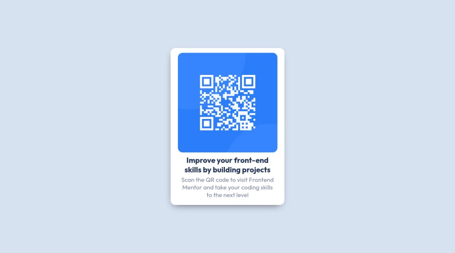
Design comparison
Community feedback
- @0xabdulkhaliqPosted over 2 years ago
Welcome you to the Frontend mentor community
REPLY:
- After inspected your code, i want to share a snippet of code that will be improve your solution
SNIPPET:
- The div
.cardis not be a div element because it affects screen reader's accessibility - So kindly change the
divintomainfor accessibilty - And finally, consider to remove the
.attribution(footer) for better viewing experience
MESSAGE:
- If my answer helps you then providing an upvote will be very gratefull
- I hope you learned a lot of stuffs during this project, Congrats Mayordey
GREETINGS:
- Peace be upon you with god's mercy & blessings Mayordey..✨
Marked as helpful3@Mayordey4uPosted over 2 years ago@0xAbdulKhalid Thank you, your answer was helpful. I'll make necessary corrections. Thanks 👍
0 - @grace-snowPosted over 2 years ago
Hi
This doesn't fit on my phone screen because you've given the card a fixed width. Don't do that. Instead, use max-width so it can shrink down when needed. It's essential that solutions work down to at least 320px wide without horizontal scroll
You also need to
- rewrite alt text. Look up how and when to use this attribute properly
- the whole card should have padding not just top and bottom
- font size must never be in px. Extremely important! Use rem
- elements like headings and paragraphs should never have padding. They should have margin. They are not boxes to have other content inside. Look up the differences between padding and margin to understand them
- either the card needs a little margin or a wrapping element can have a little padding - either of these would prevent the card from hitting screen edges like is happening now
Marked as helpful2@Mayordey4uPosted over 2 years agoThank you @grace-snow for this comment, I really appreciate. I will check that out and make necessary adjustment. Thanks 👍
0 - @msuryaditriputraRPosted over 2 years ago
Hi There 👋
Congrats on finishing this challenge 🥳
The
place-items: centeronly works when the element is a grid, so just change the body's display to grid withdisplay: grid, and don't forget to set the min-height of the body to 100vh;for your Accessibility report ⚒
- Wrap all of the content with
<main>tag, All page content should be contained by landmarks. - If you just have one heading, you have to use
h1tag for semantic meaning and you can change its style but not the tag. The page should contain a level-one heading. change yourh2tag toh1
I hope this is helpful😊 after you fix the accessibility issues, don't forget to generate a new report! 📖
keep it up your good work, Happy Coding ☕
Marked as helpful1@Mayordey4uPosted over 2 years ago@msuryaditriputraR oh thank you for taking out of your time to comment on this. I really appreciate. I will make necessary corrections. Thanks 👍
0 - Wrap all of the content with
- @HassiaiPosted over 2 years ago
Replace <div class="card"> with the main tag and <h2> with <h1> to fix the accessibility issues. for more on semantic html visit https://web.dev/learn/html/semantic-html/
To center. card on the page, add min-height:100vh; display: flex; align-items: center: justify-content: center; or min-height:100vh; display: grid place-items: center to the body. There is no need to give .card a margin value to center it.
Use rem or em as unit for the padding, margin, width and preferably rem for the font-size for more on this watch this https://youtu.be/N5wpD9Ov_To
Reduce the width of .card for it to match the design. use max-width instead of width for a more responsive content
Hope am Helpful. Happy coding
Marked as helpful1@Mayordey4uPosted over 2 years ago@Hassiai oh thank you for taking out of your time to comment on this. I really appreciate. I will check that out and make necessary corrections. Thanks 👍
0@HassiaiPosted over 2 years ago@Mayordey4u, if my comment is helpful mark it as helpful
0 - @mikej321Posted over 2 years ago
Hello there!
To center your project, I would add display: flex, flex-direction: column to the body. This will change the entire body to a flexbox and the flex-direction will cause the attribution to appear under your project. Next, add justify-content: center and align-items: center to the body. This will align the project in the center on both the X and Y axis. Here is some information on Flexbox.
https://developer.mozilla.org/en-US/docs/Learn/CSS/CSS_layout/Flexbox https://css-tricks.com/snippets/css/a-guide-to-flexbox/
Hope this helped and happy coding!
Marked as helpful1@Mayordey4uPosted over 2 years ago@mikej321 oh thank you for taking out of your time to comment on this. I really appreciate. I will check that out and make necessary adjustment. Thanks 👍
0@mikej321Posted over 2 years ago@Mayordey4u No biggie! I hope your journey goes smooth. If you ever need anything more, I'm always on Slack or you can ask here!
1
Please log in to post a comment
Log in with GitHubJoin our Discord community
Join thousands of Frontend Mentor community members taking the challenges, sharing resources, helping each other, and chatting about all things front-end!
Join our Discord
