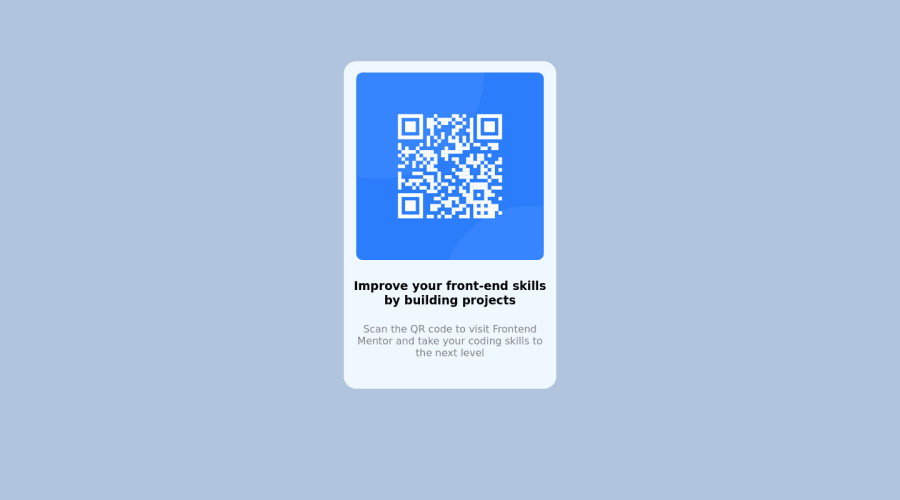
Design comparison
Community feedback
- @Chermann-KINGPosted over 2 years ago
Hi @sirsky89, here are some recommendations to improve the code you submitted:
-
The correct structure of a page when you want to use a
<header>element would be to take it as an introductory container. It must have, as its name indicates, a title from levelh1toh6, and if desired, a description or a logo... -
You include your image with a
div, which is not necessary in this case. we usedivonly when we have several elements to manage the positioning in the page. Note: always remember to have the most sober code possible (clean). -
In your CSS you attribute the value 'column' to the property Display, which is not possible. I'll let you take a look at the possible values if you don't use a Flex Box on the following link -> Display
-
Also, the
<p>and<h.>elements areinlineby default, i.e. when displayed, they are positioned one above the other and not next to each other. side of others. So no need in your case to store it by a column property value.
If you wish, you can take a look at my solution to this challenge here
I hope my feedback will be useful to you ;) Good code to you!
Marked as helpful0@sirsky89Posted over 2 years ago@Chermann-KING thank you for your time through my project. I will try my best to simplify the code, honestly it is kinda hard at first because I did it for the sake of completing the project.
0@Chermann-KINGPosted over 2 years agoYou're welcome @sirsky89. The advantage in the developer community is that we often find help from those who have gone through a path before us. The most important thing is not to provide a code quickly enough when you are a newbie, what is important is to master the basic concepts and then apply them calmly on concrete projects.
0 -
Please log in to post a comment
Log in with GitHubJoin our Discord community
Join thousands of Frontend Mentor community members taking the challenges, sharing resources, helping each other, and chatting about all things front-end!
Join our Discord
