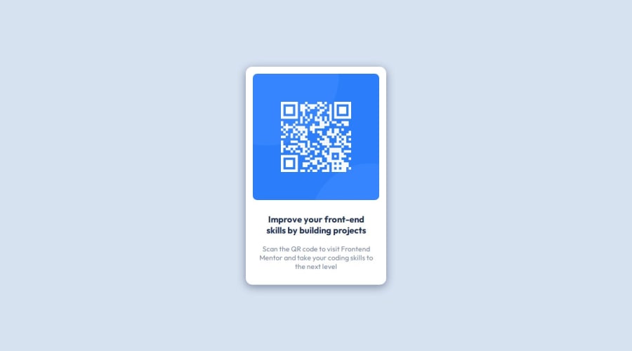
Design comparison
SolutionDesign
Solution retrospective
What are you most proud of, and what would you do differently next time?
My first project that I completed from start to finish, I think i improved on the design file by adding a box shadow which I feel that it made the design pop.
What challenges did you encounter, and how did you overcome them?I think my biggest challenge was getting all the layout pixels correct and as close to the original design.
What specific areas of your project would you like help with?I want to know if there are any good dev tools that will help me take a design file and be able to easily break down the layout so I know the measurements more easily. I would also like to know if anyone has tips on the organization/structure my code so it is more maintainable and easier to read. thank you!
Community feedback
Please log in to post a comment
Log in with GitHubJoin our Discord community
Join thousands of Frontend Mentor community members taking the challenges, sharing resources, helping each other, and chatting about all things front-end!
Join our Discord
