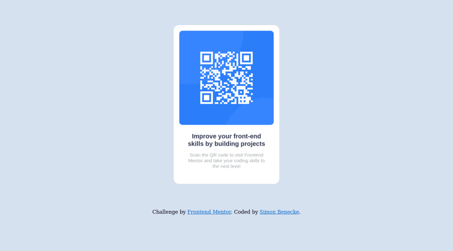
Design comparison
Solution retrospective
This was my first challenge attempt and my first project other than following along with guides. I read that the best way to go about it is to do the HTML section first and then style with css afterwards, however I did find that there are times where I go back to the html to either add or remove sections. I have no specific questions. Any feedback is welcomed.
Community feedback
- @SenatriusPosted almost 2 years ago
Great job on your first unguided project :) There are just a few things that you could improve to make it even better.
-
Card padding: instead of manually setting the image width using pixels, set image width to '100%', height to 'auto' and remove the top margin. Then add
padding: 1remandbox-sizing: border-boxto the card. In this case, visually nothing changes but for the future, if you ever want to increase or decrease the gap between card edge and image, you'll only have to change a single value. -
Responsive units: I see you're using pixels everywhere. I'd suggest switching them out for rem units so the component adjusts to the users browser settings. Some people need to set a higher default font size in the browser due to disability or other reasons and using pixels prevents that. Read up a bit more on responsive units here
-
Semantic HTML: in the same vein as responsive units, semantic html helps people with disabilities who use screen readers to browse your pages easier. In this case, change
div.white-backgroundtomain.white-background,div.text-in-whitetosection.text-in-white, anddiv.attributiontofooter.attribution. Can read up more on semantic HTML here.. Also, here's a good reference for semantic HTML tags, very useful when learning.
Outside of these few things, it looks good. Keep it up :)
Marked as helpful1 -
- @HassiaiPosted almost 2 years ago
Replace<div class="white-background">with the main tag and <div class="attribution"> with the footer tag to fix the accessibility issues. click here for more on web-accessibility and semantic html
To center .white-background on the page, add min-height:100vh; display: flex; align-items: center: justify-content: center; or min-height:100vh; display: grid place-items: center to the body.
To center .white-background on the page using flexbox:
body{
min-height: 100vh;
display: flex;
align-items: center;
justify-content: center;
}
To center .white-background on the page using grid: body{ min-height: 100vh; display: grid; place-items: center; }Use the colors that were given in the styleguide.md found in the zip folder you downloaded.
there is no need to give .white-background a height value replace that with padding value for all the sides. Give h1 the same font-size as p and the img a max-width of 100% instead of a width and height value.
Use relative units like rem or em as unit for the padding, margin, width values and preferably rem for the font-size values, instead of using px which is an absolute unit. For more on CSS units Click here
Hope am helpful.
Well done for completing this challenge. HAPPY CODING
Marked as helpful1
Please log in to post a comment
Log in with GitHubJoin our Discord community
Join thousands of Frontend Mentor community members taking the challenges, sharing resources, helping each other, and chatting about all things front-end!
Join our Discord
