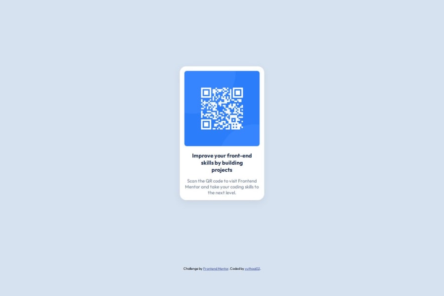
Design comparison
Solution retrospective
I feel happy because I have grasped the basic knowledge, though not in-depth, but sufficient for work. I will strive to improve and fill in the gaps in my knowledge.
What challenges did you encounter, and how did you overcome them?I'm having a bit of difficulty with the formula for rounding the corners of the image inside and the outer background. I've applied my relative calculation of the image's border-radius + the padding of the background - 2px. I'm not sure if it works exactly as intended, but I find it relatively aligned with the design.
What specific areas of your project would you like help with?This is a basic introductory interface, so I don't have any issues that require assistance at the moment. However, my knowledge still has gaps, and I am very grateful and hopeful that everyone can contribute and share their knowledge to help me fill in the missing parts
Community feedback
- @TedJenklerPosted 3 months ago
Hi @vuthoai02,
Nice project! I have a few suggestions for improvement:
You're slightly overusing <div> elements. Try replacing them with semantic HTML elements to enhance accessibility and SEO.
Consider adding OG (Open Graph) meta tags to create visually appealing, shareable links. This will also help improve SEO
Adding a clickable QR code could greatly improve usability, especially for older users—I learned this firsthand while working as a customer service agent, haha.
As an extra challenge or just for fun, you might want to explore creating custom QR codes.
Hope this feedback is helpful!
Best, Teodor
Marked as helpful1@vuthoai02Posted 3 months ago@TedJenkler Hello Teodor, thank you so much for the review. After reading your feedback, I can clearly see my shortcomings. I also often write HTML code using other tags like <p>, <h1>, but since I frequently use UI libraries, I've developed a bad habit of overusing <div> and applying classes according to those libraries. I fully recognize my mistake now thanks to your reminder. Your knowledge of SEO is incredibly valuable to someone like me who doesn't have much experience. I really appreciate you sharing this practical knowledge—it’s been very helpful to me. Once again, thank you so much. I hope that in my future projects, you can take some time to review and guide me, and I would be very grateful and honored for that. Wishing you a productive day.
1 - @anscmyersPosted 3 months ago
Semantic HTML looks good.
You may consider separating your styles into a separate styles.css stylesheet but what you've done works too.
As for the border-radius; this can be resolved by applying the same border-radius to your qr-code-card and qr-code-media -- then centering & overflow=hidden on the image so that the image takes the qr-code-media's shape.
Watch out for overflowing content when width is dramatically reduced. I took the approach of considering the recommendation of designing for 320px mobile and set that as a min-width.
Marked as helpful0@vuthoai02Posted 3 months ago@anscmyers Thank you for your feedback; I tried your solution and found it quite helpful.
0
Please log in to post a comment
Log in with GitHubJoin our Discord community
Join thousands of Frontend Mentor community members taking the challenges, sharing resources, helping each other, and chatting about all things front-end!
Join our Discord