Design comparison
SolutionDesign
Community feedback
- @frontendstuPosted over 1 year ago
Hi there @MaximilianoDanielGarcia 👋
Great effort on this! 🎉
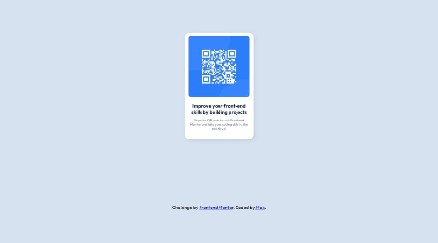
If you're wondering how to centre align the QR code component to the page give this styles a go:
body {
   display: grid;
   place-content: centre;
   /* Any other body styles */
}
I use these styles with any of the component challenges.
Marked as helpful0@MaximilianoDanielGarciaPosted over 1 year agoThanks @frontendstu!
Yeah, I know it. But I would like to have this design comparison when I'm coding haha.
1
Please log in to post a comment
Log in with GitHubJoin our Discord community
Join thousands of Frontend Mentor community members taking the challenges, sharing resources, helping each other, and chatting about all things front-end!
Join our Discord
