Not Found
Not Found
Not Found
Not Found
Not Found
Not Found
Not Found
Not Found
Not Found
Not Found
Not Found
Not Found
Not Found
Not Found
Not Found
Not Found
Not Found
Not Found
Not Found
Not Found

Submitted

QR Code Component With Vanilla HTML/CSS

@therealalexolthoff

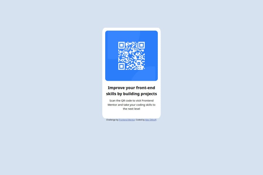
Desktop design screenshot for the QR code component coding challenge

This is a solution for...

  • HTML
  • CSS
1newbie
View challenge

Design comparison


SolutionDesign

Solution retrospective


What are you most proud of, and what would you do differently next time?

I am proud of how quickly I was able to bang this out. Something like this would have freaked me out just a few months ago, but if I can do this project quickly, I can do so much more if I am patient and persistant.

I am also proud that I only used CSS and HTML. I've always leaned heavily on a CSS framework like bootstrap, so it was nice to be able to show myself I could use just vanilla CSS/HTML.

If I could have done some things differently, these would be it:

  1. Use a bit less CSS. I want to actually go back through and see where there are opportunities to apply DRY.
  2. Commit more. I didn't commit as many times as I should have, and so it looks like I got this done faster than I did.
  3. Improve accessibility. This has always been an issue for me, and I am sure I have areas to improve.

What challenges did you encounter, and how did you overcome them?

This wasn't really challenging for me. I guess one thing I struggled a bit with was how to use the Figma design. I still need to make some minor style changes based on the Figma file and the style guide.

What specific areas of your project would you like help with?

Real quick:

I don't have a readme and there are some colors missing. I know, I am working on it.

What I want feedback on:

First, I have always preferred using IDs for styling, but would it have been better to use something else, eg: classes?

Second, I feel like my CSS is very "basic". It's incredibly rigid and hard-coded. What could I have done to make it more flexible, and feel less rigid? I don't know if this makes sense, I hope so.

Finally, accessibility. I am going to work on this, but what would be the lowest hanging fruit accessibility improvements I could make?

Community feedback

haquanq ®️ 1,585

@haquanq

Posted

Hello @therealalexolthoff 👋 👋 👋

Congrats on completing your first challenge, here is my feedback for you:

  • Most of the time for styling it would be best to use class. Simply if you use an unique id on one element, the other should not have it and it is painful to remember which element did i/you used this id because i/you can't use it here (browsers still render it, you can still style same multiple id) to bind my JavaScript to element with such id.
  • About CSS you can check out some of my beginner solution on my GitHub repo
  • The lowest hanging fruit of web accessibility is using semantic HTML markup at the right place and only using div for styling purpose (ex: you want to group related content like a heading or paragraph and style it in different ways on different screen size from vertical to horizontal or if the content stay the same don't wrap it), keep your HTML as simple as possible.

Hope this help 👽👽👽

Marked as helpful

0

@therealalexolthoff

Posted

@haquanq Thank you so much! I went ahead and switched to semantic markup even though it felt a bit weird. I also used classes as recommended, and I checked out your version: I see you used a lot of CSS variables, which makes sense. I am going to set up a few at a later point, right now I want to move to something new, but I really appreciate the feedback and I am glad I checked your version out.

0

@yourstrulycreator

Posted

It's good

0

@therealalexolthoff

Posted

@yourstrulycreator Thank you!

0

Please log in to post a comment

Log in with GitHub
Discord logo

Join our Discord community

Join thousands of Frontend Mentor community members taking the challenges, sharing resources, helping each other, and chatting about all things front-end!

Join our Discord