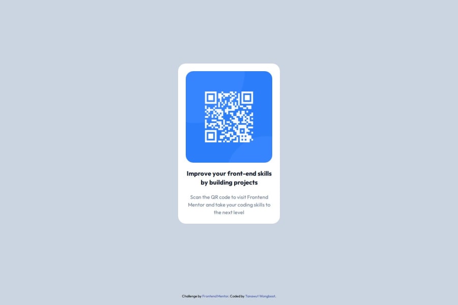
Design comparison
SolutionDesign
Community feedback
- @iyedooPosted 7 months ago
Good job! The submission looks amazing and very close to the original design. I just want to point out some things that you may fix:
- This challenge is "FREE+" which means you can check the design files in figma and therefore check design details like border-radius, spacings, widths and heights...
- It's always better to follow the style-guide.md file for text colors and backgrounds instead of using tailwind colors.
However the code is clean, uses semantic html and is well organized! I'd give this a 8.5/10!
Marked as helpful0
Please log in to post a comment
Log in with GitHubJoin our Discord community
Join thousands of Frontend Mentor community members taking the challenges, sharing resources, helping each other, and chatting about all things front-end!
Join our Discord
