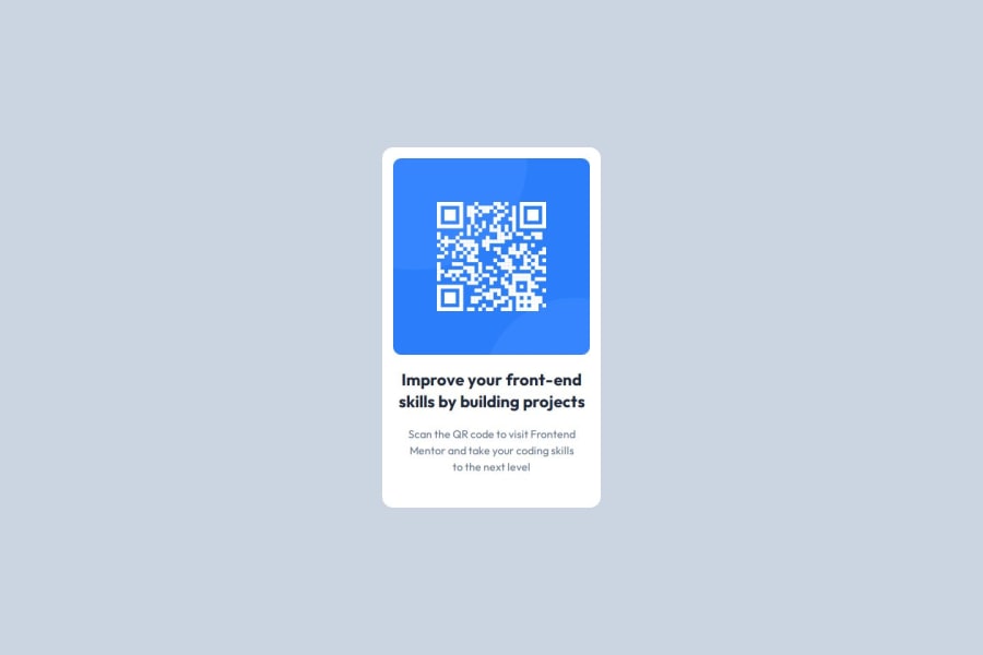
Design comparison
SolutionDesign
Solution retrospective
What are you most proud of, and what would you do differently next time?
This was a complete walkover
Community feedback
- P@tloyanPosted 6 months ago
There are some subtle differences between your solution and the design. The "Slate" color from Tailwind differs from the one in the design. The same goes for the font sizes in Tailwind, there are a few discrepancies. Also, you missed the drop shadow. ;)
Marked as helpful0@ThatHorseRepPosted 6 months ago@tloyan Thank you for your feedback, I'll be sure to fix those errors.
0
Please log in to post a comment
Log in with GitHubJoin our Discord community
Join thousands of Frontend Mentor community members taking the challenges, sharing resources, helping each other, and chatting about all things front-end!
Join our Discord
