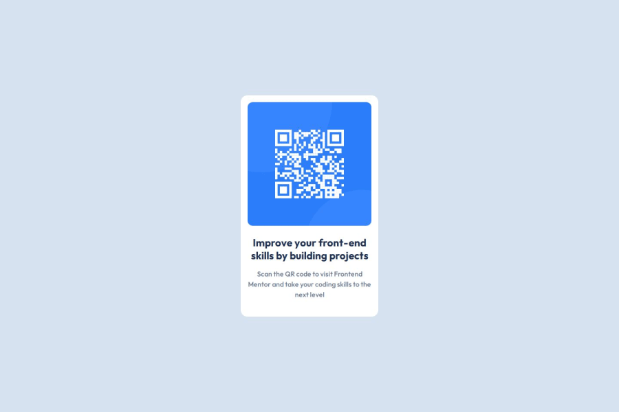
Design comparison
Solution retrospective
Not entirely comfortable with text sizing. Also I am not familiar with figma and it was not clear whether I need to make component with fixed width or responsive.
What specific areas of your project would you like help with?I faced mental collapse where I shouldn't have. I had a flex container with image and a text block underneath. And text block made everything wider than the image width, which I couldn't find how to fix except basically specify the width to the flex container.
Community feedback
- @grace-snowPosted 7 days ago
Well done on the first draft! It's looking pretty good but has a lot of the common beginner mistakes that need correcting before you move on.
- never limit the height of elements that contain text, even the main or body. Because you've limited this to 100vh the content is getting very badly cut off at some screen sizes. Instead, set min-height so that the element is allowed to grow taller when it needs to.
- you'd want main to be a flex column not row (the default) on any site if you made it a flex item.
- there's no need for an extra inner div in this. Keep the html simple. This card is one div with an image, heading and paragraph. The content doesn't need nesting inside an extra div.
- the card mustn't have a width. That's not robust and will break if users change their text size. Instead, use max-width so the card can grow up to the limit you've set, but can also shrink narrower when it needs to. (You can optionally make the card width 100% if you need to ensure it is as wide as the max width when space allows).
- Similarly, the img doesn't need a width or height. All it needs for sizing is what's already included in the css reset (display block and max-width 100%). If you want a performance boost you can also give this an aspect-ratio of 1 (or width and height attributes in the html).
- The image is the most important content on the page! That means it must have an
alt
description that says what it is (QR code) and where it goes (to FrontendMentor.io). - This component would never be used to serve the main heading on a page. So you know it shouldn't have a h1. Use a lower importance heading level like h2 instead.
Marked as helpful1@ddosiaPosted 7 days ago@grace-snow thanks, that's very helpful and detailed comments. I will address it. One thing I don't understand though, is on the design images it looks same size both on desktop and mobile. This confused me a lot, I got the sizes from figma and restricted image so it won't change.
0@ddosiaPosted 6 days ago@grace-snow hopefully I've addressed your comments to the best of my understanding! Thanks, I really appreciate your time!
0@grace-snowPosted 6 days ago@ddosia The alt text on the image is still too generic. If you consider where this would be used on a real site, these kinds of cards are often included with multiple of them on one page. It's no good if all QR code images are labelled only as "QR code". That's why I said it needs to include where that QR code goes to.
Marked as helpful0
Please log in to post a comment
Log in with GitHubJoin our Discord community
Join thousands of Frontend Mentor community members taking the challenges, sharing resources, helping each other, and chatting about all things front-end!
Join our Discord