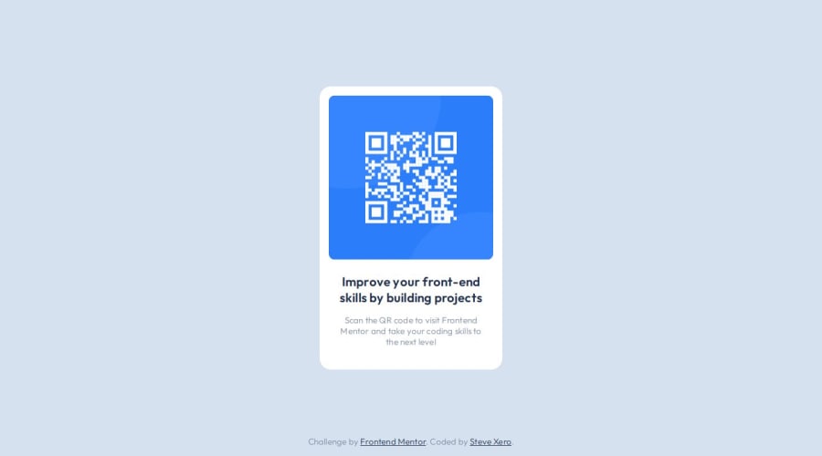
QR Code Component with semantic HTML, no classes and CSS no flex/grid
Design comparison
Solution retrospective
I am proud of not using any class or id attributes in any of my HTML tags. I am also proud that I did not use flexbox or grid in my CSS.
What challenges did you encounter, and how did you overcome them?The biggest challenge I encountered was wanting to over-engineer everything. I paid close attention to inheritance and did my best to use it to my advantage.
What specific areas of your project would you like help with?I wrapped the whole card component in a section tag. Should I have separate semantic tags for the card image and the card info?
Community feedback
- @Mirjax2000Posted 8 months ago
Hello. I was curios to your code, to your aproach without classes or IDs and without flexbox.
Yes it works, but what if the project is thousands of lines of code? What if you are using javascript? There you need IDs for sure. If you have problem with naming focus on BEM techiques, it is very useful especialy when you are working with Sass. I love it.
Why do you dont want use flexbox? You must replace it with position absolute and there will be problem with document flow when you have more elements on the page.
Flexbox has full support in all browser, or you can use autoprefixer also to fill the webkit needs. display: grid is also awesome, when building layouts.
Another thing. You are using fixed values in pixels too much. Using pixels for font size is Crime in these days. You declare --font-size-heading: 22px; and what if i have bad eyes? I am use to set my default font size in the browser from 16 to 24 for example. But you made it hardcoded. It will be 22 and nobody can adapt it in their browser. Here with fonts are EM,REM units to be used. It will calculate default size form browser and recalculate to the REM,EM units. EM units has another cool property to use it with another sizes with, padding, margin, on buttons or else. Check this video form Kevin Powell. https://www.youtube.com/watch?v=_-aDOAMmDHI&ab_channel=KevinPowell and that is only beggining, my coding is based on REM,EM and percentages. That helped me save times with responsive and dynamic resolutions. I dont need too many breakpoints in my page.
I also saw that you are skilled programmer. You already made some challenges 2 years ago and did you stop after that? Now you comming back? Trying some practise here? If so i am in same situation. I quit year ago and now i am comming back as well.
Good luck and never stop, even if you thing that you are not smart enough to overcome problems. You must be persistent. It takes time.
Thank you for your Time, see you around
Marked as helpful2@stevexeroPosted 8 months ago@Mirjax2000 Hey thanks for the reply! I can see how my solution retrospect comments can come across, it wasn't meant to be anti-tech.
The point of it was, I've been on this platform for a while and just doing whatever projects I felt like without ever really digging deeper into the awesomeness of what Frontend Mentor really is! So to remedy this, I've started from the beginning, the learning paths.
I've used tons of tech for a variety of reasons, and in the scope of this particular project, almost anything extra would be overkill. But you're absolutely correct in that it's not scalable.
You're also spot on about my usage of pixels! I will be addressing this as I work on the newbie projects (it's part of the plans of a project). Thank you for the resource!
Yeah I was focusing on the frontend starting about 6 years ago (had some periods of burnout between then and now, as well), then my focus shifted towards the backend, then to lower-level languages, then to wanting to play with hardware lol. I look at life like a never-ending learning experience. Get out there and play around!
Thank YOU for your time!
1
Please log in to post a comment
Log in with GitHubJoin our Discord community
Join thousands of Frontend Mentor community members taking the challenges, sharing resources, helping each other, and chatting about all things front-end!
Join our Discord