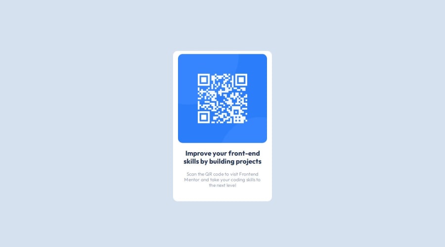
Design comparison
SolutionDesign
Solution retrospective
What are you most proud of, and what would you do differently next time?
_
What challenges did you encounter, and how did you overcome them?_
What specific areas of your project would you like help with?I feel the font looks a little bit different from what's available in Figma. I "THINK" I'm specifying the same properties, such as font-family, font-weight, etc., as in Figma, so I'm wondering where the difference comes from.
Community feedback
Please log in to post a comment
Log in with GitHubJoin our Discord community
Join thousands of Frontend Mentor community members taking the challenges, sharing resources, helping each other, and chatting about all things front-end!
Join our Discord
