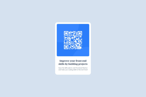
QR Code Component with only HTML and CSS

Solution retrospective
I am most proud of my use of div tags along with knowing the different CSS styles to utilize on this project! Something I would like to do next time is minimize a lot of the code.
What challenges did you encounter, and how did you overcome them?I faced challenges when it came to specificity. I wasn't able to implement some of the styling used because they were being overridden by other styles. Overcoming this took some debugging that allowed me to find that I had issues with some of the style's syntax and plugging in dummy colors to show which colors were being overridden and which were working.
What specific areas of your project would you like help with?I feel like I have done this basic project to the best I could, but learning is always a must in any scenario. How can I improve the positioning of the component as a whole? I set margin: auto; to have the whole card component centered but I feel there may be more responsive methods to implement this. Any advice is appreciated!
Please log in to post a comment
Log in with GitHubCommunity feedback
No feedback yet. Be the first to give feedback on Ankur Patel's solution.
Join our Discord community
Join thousands of Frontend Mentor community members taking the challenges, sharing resources, helping each other, and chatting about all things front-end!
Join our Discord