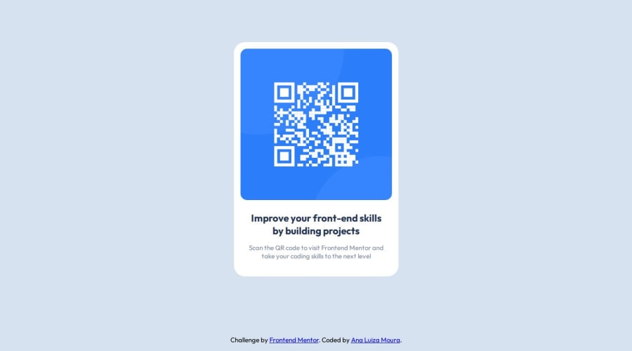
Design comparison
Solution retrospective
Being able to tackle this challenge in less than an hour.
What challenges did you encounter, and how did you overcome them?Centering all the elements
What specific areas of your project would you like help with?Adding accessibility to the web page.
Community feedback
- @JoramirJrPosted about 1 year ago
Hi, @ana-lsm!
One easy step to center your card would be to first define its margin to 0, then the 'height' of the body to '100vh'; after that, by defining 'display: grid' and 'place-items: center' to the body, your card would be centered!
Hope its helpful!
Marked as helpful1@ana-lsmPosted about 1 year agoThanks @JoramirJr !
I did felt like there was a better way to do it, jus didn't know how haha, but I'll remember your tip for next time! Thanks a lot!
1 - @DavisnzPosted about 1 year ago
Looks good! Just make sure to pay extra attention to the padding and dimensions. Figma's dev tool is great for this
Marked as helpful1@ana-lsmPosted about 1 year agoThanks for the tip @Davisnz!
I still need to learn how to use this other design tools haha, but i'll get there! =)
1
Please log in to post a comment
Log in with GitHubJoin our Discord community
Join thousands of Frontend Mentor community members taking the challenges, sharing resources, helping each other, and chatting about all things front-end!
Join our Discord
