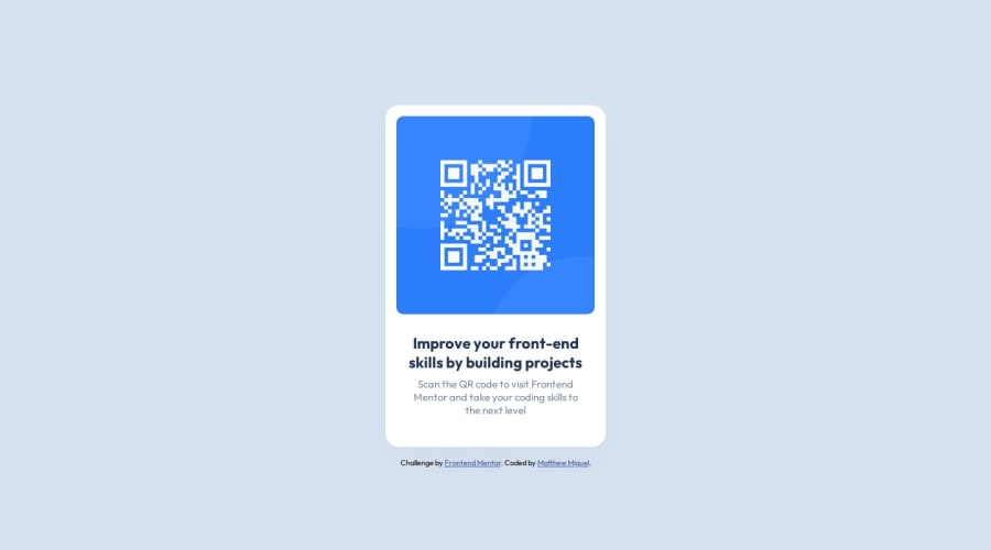
Design comparison
Solution retrospective
That I completed this challenge in less than an hour
What challenges did you encounter, and how did you overcome them?Figuring out how to center the card on the screen. Realized I needed to target the correct container with flexbox.
What specific areas of your project would you like help with?any tips for getting the correct dimensions from the figma file? felt I had to search around to find the padding, margins, etc.
Community feedback
- @R3ygoskiPosted 6 months ago
Hello Matthew, congratulations on completing the project! Despite having difficulties finding the correct dimensions, you managed to make your solution very similar to the proposed design! Well done.
Yes, I have a tip for you regarding finding the correct dimensions. There's a browser extension called PerfectPixel that you might find helpful. Take a look at it.
Regarding centering the content, here's a tip: if you need to center all the content in the middle, try using flexbox on the
body
. Also, consider using a CSS reset. Here's a basic example:* { padding: 0; margin: 0; }
This selects all elements with the global selector (
*
) and removes theirpadding
andmargin
, thus eliminating the initial spacing on your page.Another tip, this time related to your HTML: it's well-structured, but there's an empty
<div>
that I recommend removing. Additionally, I noticed that your HTML lacks semantic tags, which could result in accessibility errors. Here are some tags that could be changed and why:<div class="container">
: I recommend changing this<div>
to<main>
, as it contains your main content and should always follow the<body>
tag.<div class="card">
: Consider changing this<div>
to<article>
, as its content is self-explanatory and independent.
Again, congratulations on your excellent project! If anything I said isn't clear, please comment below, and I'll try to help as best as I can.
Marked as helpful3@MattJM1007Posted 6 months ago@R3ygoski wow! what a helpful response. Thank you!
I will definitely keep in mind those tags. I actually just fixed up my solution and updated it on github. The card is now almost identical to the design, only the margins around the text are a little off.
Really appreciate your feedback!
1 - @0xabdulkhaliqPosted 6 months ago
Hello there 👋. Congratulations on successfully completing the challenge! 🎉
- I have a suggestion regarding your code that I believe will be of great interest to you.
MAKE QR CODE ACCESSIBLE :
- The QR Code Component involves scanning the QR code, the image is not a decoration, so it must have an
alt
attribute which should explain the purpose of theimage
.
- The
alt
withqrcode
is not even explaining for what the QR image need to be used.
- So update the
alt
with meaningful text which explains likeQR code to frontendmentor.io
- Example:
<img src="/images/image-qr-code.png" alt="QR code to frontendmentor.io">
.
I hope you find this helpful 😄 Above all, the solution you submitted is great !
Happy coding!
Marked as helpful0@MattJM1007Posted 6 months ago@0xabdulkhalid thank you so much for your feedback! I am never sure what exactly to put in the alt attribute, so this is really helpful. Appreciate it!
0 - @danielmrz-devPosted 6 months ago
Hello there!
Congrats on completing the challenge! ✅
Your solution is really impressive!
I've got a couple of ideas (about how to use HTML better) that could make it even stronger:
📌 First: Think about using
<main>
to wrap your main content instead of<div>
.Imagine
<div>
and<span>
in HTML as basic containers. They're good for holding stuff, but they don't tell us much about what's inside or its purpose on the webpage.📌 Second: Consider using
<h1>
for your main title instead of<h2>
.It's more than just text size — it's about structuring your content effectively:
- The
<h1>
to<h6>
tags are used to define HTML headings. <h1>
is for the most important heading.<h6>
is for the least important heading.- Stick to just one
<h1>
per page – it should be the main title for the whole page. - And don't skip heading levels – start with
<h1>
, then use<h2>
, and so on.
These tweaks might not change how your page looks, but they'll make your HTML code clearer and help with SEO and accessibility.
Hope that's helpful!
Keep up the great work!
1@MattJM1007Posted 6 months ago@danielmrz-dev that's very helpful Daniel! Thanks for taking the time provide feedback. I will definitely update my code with these. Appreciate it!
1 - The
- @WauespterPosted 6 months ago
Sobre seu comentário, alguma dica para obter as dimensões corretas do arquivo figma, me recomendaram o uso da extenção PerfectPixel, dessa forma você consegue aproximar o seu projeto do design.
1
Please log in to post a comment
Log in with GitHubJoin our Discord community
Join thousands of Frontend Mentor community members taking the challenges, sharing resources, helping each other, and chatting about all things front-end!
Join our Discord