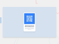
Design comparison
Solution retrospective
Thanks for checking out my solution. Please share your opinions and feedback so that i can improve it more.
Community feedback
- @GitHub-dev12345Posted over 2 years ago
Congratulations on finishing your challenge! 🎉
I have some feedback on this solution:
- Reduce the accessibility Used this code.
2.<div class ="attribution"> to <footer class ="attribution">
Used this property to center the card body{ display:flex; justifiy-content: center; align items: center; min-height:100vh }
and card class used this proerty .card{ align-self: center } if my solution has helped you do not forget to mark this as helpful!
Marked as helpful1 - @slothmast3rPosted over 2 years ago
Hey man! Great work. I studied your code and what I recommend is to be more consistent in your styling (or just use classes). Your styles are all over the place. Some in DOM elements e.g.
style="..."some in<styles>.... </stylesand some in file style.css. Just use one and be consistentMarked as helpful1@sshiv5768Posted over 2 years ago@slothmast3r Thanks for the feedback. I will surely keep it in my mind.
0 - Account deleted
Hello there! 👋
Congratulations on finishing your challenge! 🎉
I have some feedback on this solution:
-
Always Use Semantic HTML instead of
divlike<main><header>, etc for more info -
Give The body these properties to center the element
display:flex justifiy-content:center align items: center min-height:100vh
if my solution has helped you do not forget to mark this as helpful!
Marked as helpful0 -
- @RioCantrePosted over 2 years ago
Hello there! Good job in completing this project. Looking at your solution, I would suggest the following for you...
- Import the
attributionstyle in CSS file and removestyletag - Wrap the whole content of
cardwith specific tag likemainandattributionwithfooter. For HTML structures, refer it with this one Semantics - Instead of inline style, import the style in CSS file
- Include description in the
altinimgtag, like this line<img src="images/image-qr-code.png" alt="" style="width: 90%"> - Clean the whitespaces in the code
- Adjust the margin in
.cardwithmargin: 7rem auto; - Add
font-size: 22px;,margin: 0;andpadding: 0 1rem;inh2rule set - Add
padding: 0 1.1rem;inprule set - Add
padding-bottom: 1.8rem;in.containerrule set - Remove
margin-top: 10px;inimgand replace it withmargin: 1rem;
Above all, you did good and Keep up the good work! Hope this helps!
1@sshiv5768Posted over 2 years ago@RioCantre Thanks for this brief feedback. I will definitely try this.
0@RioCantrePosted over 2 years ago@sshiv5768 No worries! I would appreciate it if you mark it also as HELPFUL! Cheers!
0 - Import the
Please log in to post a comment
Log in with GitHubJoin our Discord community
Join thousands of Frontend Mentor community members taking the challenges, sharing resources, helping each other, and chatting about all things front-end!
Join our Discord

