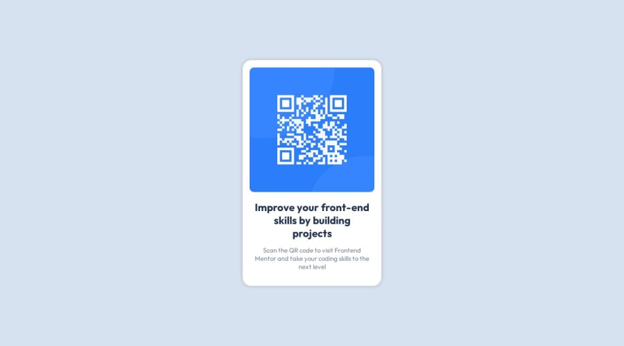
Design comparison
Solution retrospective
I used position:absolute to center the card in the middle of the webpage.
Is there a better/efficient way to center it? Is this method good enough? Thanks in advance.
Community feedback
- @hernanpogPosted almost 2 years ago
You have 2 options:
- you could use CSS Flexbox property on the body like this:
body { display: flex; justify-content: center; align-items: center; }
- You can set your div element (the container of the img and text) to: div { margin: 0 auto; }
I don't know if the second option works. I've never tried it but I saw it in a video and could work. Either way is good enough for this project since it's a very simple one.
Marked as helpful1 - @john-miragePosted almost 2 years ago
Hello,
yes flexbox or grid can help you center the card, they should be a better option than absolute position because the card stay in the flow, so it may be a better practice.
1
Please log in to post a comment
Log in with GitHubJoin our Discord community
Join thousands of Frontend Mentor community members taking the challenges, sharing resources, helping each other, and chatting about all things front-end!
Join our Discord
