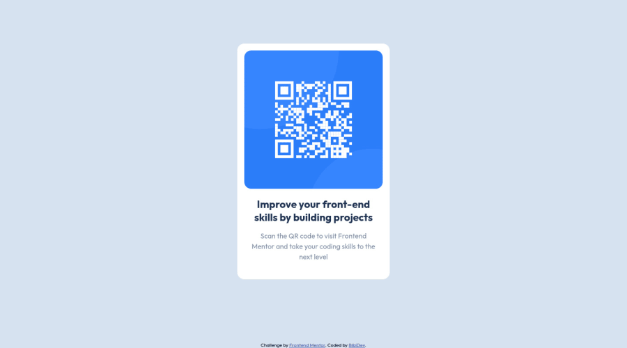
Design comparison
SolutionDesign
Community feedback
- @denieldenPosted almost 3 years ago
Hi Kenny, I took some time to look at your solution and you did a great job!
Also I have some tips for improving your code:
- add
maintag and wrap the card for Accessibility - remove all
marginfromcardclass - try to use flexbox to the body for center the card. Read here -> best flex guide
- after add
min-heigth: 100vhto body because Flexbox aligns to the size of the parent container
Overall you did well :)
Hope this help and happy coding!
Marked as helpful1@PomPoko-labPosted almost 3 years ago@denielden Hey Deniel, thanks for the tips. I'll definitely implement it asap and use it for future projects! :)
edit: I went ahead and added the flexbox integrations as you recommended and it furthered my knowledge in flexbox. Thank you.
1 - add
- @EmmanuelHexerPosted almost 3 years ago
Great work overall man.
- To fix your accessibility issues wrap your card in a main element.
Marked as helpful1@PomPoko-labPosted almost 3 years ago@Phalcin Hey Emmanuel, thanks for your tip. I'll definitely implement and use it for future projects! :)
0
Please log in to post a comment
Log in with GitHubJoin our Discord community
Join thousands of Frontend Mentor community members taking the challenges, sharing resources, helping each other, and chatting about all things front-end!
Join our Discord
