

Design comparison

Solution retrospective
I learned to work from a design system on figma
Community feedback
- P@Islandstone89Posted 11 days ago
Well done, Daniele!
Here are some suggestions:
HTML:
-
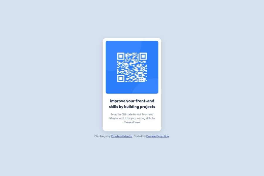
Don't use words like "image" or "photo" in the alt text. Screen readers start announcing images with "image", so an alt text of "image of qr code" would be read like this: "image, image of qr code". Also, the alt text must say where it leads(the frontendmentor website). A good alt text would be "QR code leading to the Frontend Mentor website."
-
I would change the heading to a
<h2>- a page should only have one<h1>, reserved for the main heading. As this is a card heading, it would likely not be the main heading on a page with several components. -
Change
.attributionto a<footer>, and use<p>for the text inside. The<footer>must be outside of the<main>- both should be direct children of the<body>.
CSS:
-
Make a habit of including a modern CSS Reset at the top of the stylesheet.
-
I recommend adding a bit of
padding, for example16px, on thebody, to ensure the card doesn't touch the edges on small screens. -
Move the styles on
maintobody. -
On the
body, changeheighttomin-height: 100svh— this way, the content will not be cut off if it grows beneath the viewport. Also, addgap: 1rem, to create a bit of space between the<main>and the<footer>. -
Since you're using
gap, you can removemargin-bottomon the card. -
You don't need to set
margin: 0andpadding: 0on.card__text, since you set those values on all elements using the*selector at the top. -
Remove the
widthandheightinpxon the card. We rarely want to give a component a fixed size, as we need it to grow and shrink according to the screen size. -
We do want to limit the width of the card so it doesn't get too wide on larger screens. To solve this issue, give the card a max-width of around 20rem.
-
letter-spacingmust not be inpxor%. You can useem, where1emequals the element's font size. -
Since all of the text should be centered, you only need to set
text-align: centeron the body, and remove it elsewhere. The children will inherit the value. -
Paragraphs have a default value of
font-weight: 400, so there is no need to declare it. -
On the image, add
display: block,height: autoandmax-width: 100%- the max-width prevents it from overflowing its container. Without this, an image would overflow if its intrinsic size is wider than the container.max-width: 100%makes the image shrink to fit inside its container.
Marked as helpful1@Daniele-FiorentPosted 10 days ago@Islandstone89 Wow! I did not think I would receive such descriptive and helpful suggestions. I have made changes following your suggestions, thank you very much!
1P@Islandstone89Posted 10 days ago@Daniele-Fiorent happy to help - you did an excellent job applying the changes 🙂
1 -


Please log in to post a comment
Log in with GitHubJoin our Discord community
Join thousands of Frontend Mentor community members taking the challenges, sharing resources, helping each other, and chatting about all things front-end!
Join our Discord