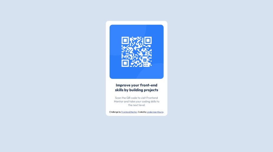
Design comparison
Solution retrospective
This is the first project I made and published.
What did you find it difficult while building the project?
I had problems with setting the right height and width and centralizing objects.
Which areas of your code are you unsure of?
I didn't use Media query so I'm not sure if this is the expected result, the part while I centralize the objects and the size of the body.
Do you have any questions about best practices?
when you deal with a specific element it's better to cascade like body > section > a or use a class?
If anyone has good material on centralizing and tips on margins I would appreciate.
Community feedback
Please log in to post a comment
Log in with GitHubJoin our Discord community
Join thousands of Frontend Mentor community members taking the challenges, sharing resources, helping each other, and chatting about all things front-end!
Join our Discord
