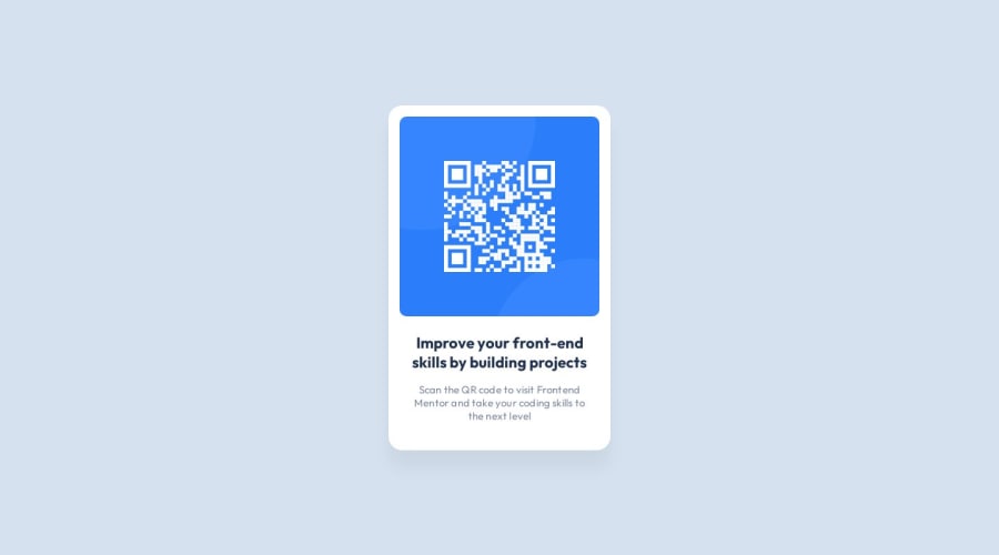
Design comparison
Solution retrospective
Hey community!
I would love any feedback on the code quality.
I made sure to incorporate what I read from other comments (use main, h1, alt tag), but are there any other things I missed?
I also only used the width/height from the Figma file for the text section and didn't use a margin—the only margin I used was on the image; is this fine?
Thank you so much :)
Community feedback
- @EugeniaAntonovaPosted 11 months ago
Hej, Jessica! I really love your work! I would only consider to get rid of unnessesery wrapper (.text) and this pice of css
.text { display: flex; height: 129px; flex-direction: column; justify-content: center; align-items: center; gap: 16px; flex-shrink: 0; }``` hard-coding height is not a good practice, as far as i know. and you don`t really need flex to vertically align text elements - they both have display: block natively - so they take the whole line anyway and align one under another beautifully. just give margins from top to bottom and everything lines up as you need! wish you all the best in your career!
Marked as helpful0@jessicaalinPosted 11 months ago@EugeniaAntonova Thank you! You're right—that extra div wasn't needed. And I've also switch to use relative units.
Best of luck to you as well!
1 - @CodacadPosted 11 months ago
It's very nicely coded
0
Please log in to post a comment
Log in with GitHubJoin our Discord community
Join thousands of Frontend Mentor community members taking the challenges, sharing resources, helping each other, and chatting about all things front-end!
Join our Discord