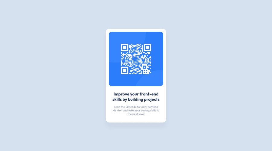
Design comparison
Solution retrospective
I have not found difficulties by the way I learnt how to use git pages and I familiarized with frontend mentor process. I had a problem with the img tag in particular with the src attribute: when I used:
<img src="../qr-code-component/images/image-qr-code.png" alt="qr code">It worked online But at the very beginning, i used this path:
<img src="/images/image-qr-code.png" alt="qr code">Look at the path! It was a bit different. It was working with the Local "Live server" function of VS code, so I said great! but not working online in the github pages. (Not working means that the image did not show up).
Why do i have to change the path and write in that way to make it work online too?
Community feedback
- @PhoenixDev22Posted about 2 years ago
Hi PEmanuele,
Congratulation on completing this frontend mentor challenge. Your solution looks great. I have some suggestions regarding your solution:
- You should use
<main>
for the card. HTML5 landmark elements are used to improve navigation experience on your site for users of assistive technology.
- In my opinion, the image is an important content. The alternate text is needed on this image. The alternate text should indicate where the Qr code navigate the user : like
QR code to frontend mentor
not describes the image.
- Never use
<div>
and<span>
alone to wrap a meaningful content. Just keep in mind that you should usually use semantic HTML in place of the div tag unless none of them (the semantic tags) really match the content to group together. By adding semantic tags to your document, you provide additional information about the document, which aids in communication.
- You can use
<p>
forclass="description"
.
- There are some unnecessary div’s need to be removed.
- Adding max-width on the body tag to prevent layout from stretching. If you try to zoom out on your browser , you'll see that the layout stretches, adding max-width will prevent that. Personally, I don’t restrict the width or height of the body element. If I need to restrict the width I use a container div with a max-width on it.
- For future use: Best practice is to use the simplest selector possible while maintaining the minimum required specificity. As a rule, if a selector will work without it being nested then do not nest it. That is to say, how quickly a browser can match the selectors your write in CSS up with the nodes it finds in the DOM. As in this challenge, there is only one element of each kind, you wouldn't face any issues , but you should maintain good practices from the beginning.
- Consider using rem and em units as they are flexible, specially for font size better to use rem. If your web content font sizes are set in absolute units, such as pixels, the user will not be able to re-size the text or control the font size based on their needs. Relative units “stretch” according to the screen size and/or user’s preferred font size, and work on a large range of devices
line-height: 19px
Use a unitless line-height value to Avoid unexpected results. You can read more in mdn
Hopefully this feedback helps.
Marked as helpful1@emazackPosted about 2 years ago@PhoenixDev22 Thank you! I will take notes about this!
Do you think is it right to develop as you should create an entire page while you are creating just a component? (The idea to use nested selectors in the css and more nested divs in the HTML structure came from my "experience" that in bigger projects like multi page/component websites is easier to came up with problems if you are not specific and if you have less control of the divs)
0@PhoenixDev22Posted about 2 years ago@emazack
I agree that nesting too many levels deep should be avoided, I don’t think that makes nesting a bad thing .I’m just saying that there’s nothing forcing me to have deeply nested code (for example scss), it’s not that hard to avoid this. Most of the downsides of nested for example "Sass" come about from nesting too many levels deep. As a rule, if a selector will work without it being nested then do not nest it. …whenever declaring your styles, use the least number of selectors required to style an element.
Hopefully this clarifies it. Happy coding
Marked as helpful0 - You should use
- @AdrianoEscarabotePosted about 2 years ago
Hello everything is fine?
Congratulations on the challenge, you did a great job.
I'll explain why the way you used to specify where the image is, wasn't working. Basically it's because you went from folder to folder looking for an image and in the case of the first folder, depending on how you committed it to github, it didn't exist and the error you commented on ends up.
The second way was from the
images
folder, which in this case is on your github, and then you put the image, that is, github managed to find the file.Hope it helps... 👍
Marked as helpful1
Please log in to post a comment
Log in with GitHubJoin our Discord community
Join thousands of Frontend Mentor community members taking the challenges, sharing resources, helping each other, and chatting about all things front-end!
Join our Discord