

Design comparison

Solution retrospective
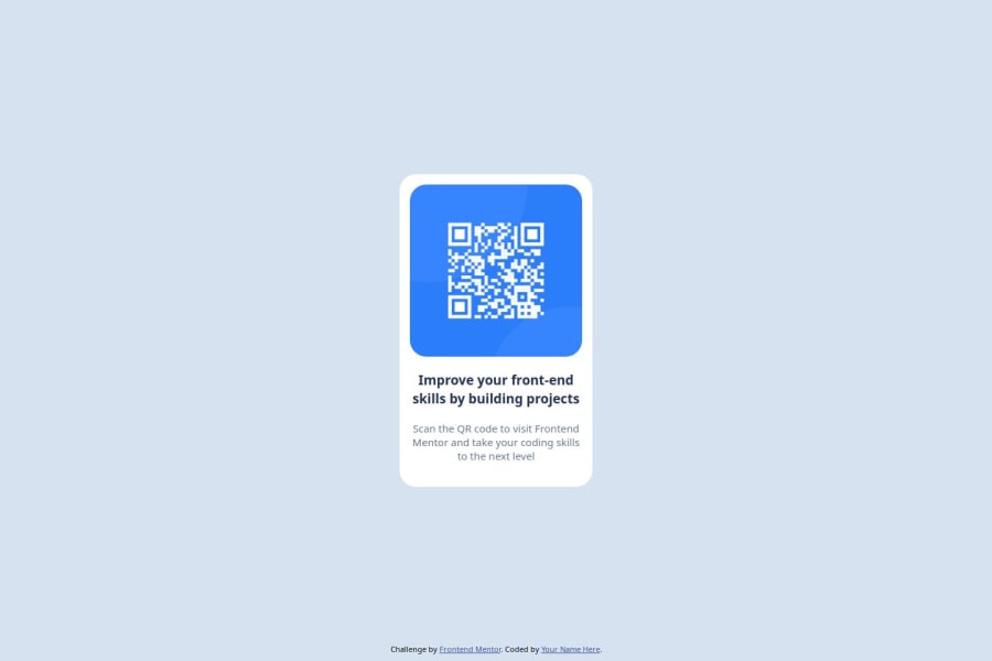
happy with how im overcome the stuff part which is style same as the preview
What challenges did you encounter, and how did you overcome them?style part, overcome by try and searching
What specific areas of your project would you like help with?code distribution
Community feedback
- @manuelstolzePosted about 1 month ago
Great solution so far!
Because you use your own css-definition of
.attributionyou can remove the default one at the top. In bigger projects this can lead to some tricky side-effects.0 - @opeoluwa7Posted about 1 month ago
In landscape mode ( a larger screen size ) your footer overflows onto the container and overlaps it, and your container lacks padding also in some screen sizes, maybe it’s the image overflowing to the top
I think it’s because you used margin 0 auto
0 literally means zero margin top & bottom while auto affects left and right
Use margin-inline: auto; instead to achieve the same result without affecting the top margin so it looks good on other screen sizes
0


Please log in to post a comment
Log in with GitHubJoin our Discord community
Join thousands of Frontend Mentor community members taking the challenges, sharing resources, helping each other, and chatting about all things front-end!
Join our Discord