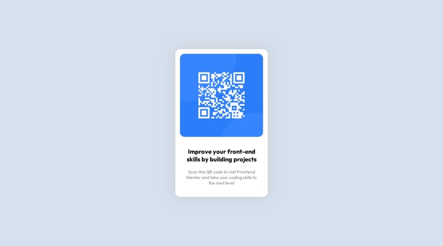
QR Code Component Webpage using HTML, CSS & GRID
Design comparison
Community feedback
- @NehalSahu8055Posted almost 2 years ago
Hello Coder 👋.
Congratulations on successfully completing the challenge! 🎉
Few suggestions regarding design.
➨Remove
width:1440pxfrombodyas this is unnecessary to add in this design.➨Remove
marginsfrom.cardas this will not dynamically center the card.➨To properly center the container.
- USING FLEXBOX
body{ min-height: 100vh; display: flex; align-items: center; justify-content: center; }- USING GRID
body{
min-height: 100vh;
display: grid;
place-items: center;
}
➨ Use
Semanticsfor the proper design of your code.<body> <header> <nav>...</nav> </header> <main>...</main> <footer>...</footer> </body>-
Every site must have one
h1 elementdescribing the main content of the page. -
So, Add a
level-one headinginstead ofptoimprove accessibility. -
<h1 class="head">Improve your front-end skills by building projects</h1> -
For
non-decorative imagesgive meaningful and descriptive alt likealt= "QR code to Frontend Mentor website". -
Use
responsive units(rem, em, %)from next project. Explore respective use cases on google.
link.
I hope you find this helpful.
Happy coding😄
Marked as helpful0 - @0xabdulkhaliqPosted almost 2 years ago
Hello there 👋. Congratulations on successfully completing the challenge! 🎉
- I have other recommendations regarding your code that I believe will be of great interest to you.
CSS 🎨:
- Looks like the component has not been centered properly. So let me explain, How you can easily center the component without using
marginorpadding.
- We don't need to use
marginandpaddingto center the component both horizontally & vertically. Because usingmarginorpaddingwill not dynamical centers our component at all states
- To properly center the component in the page, you should use
FlexboxorGridlayout. You can read more about centering in CSS here 📚.
- For this demonstration we use css
Gridto center the component.
body { min-height: 100vh; display: grid; place-items: center; }- Now remove these styles, after removing you can able to see the changes
.card {
margin: 100px auto;
}
- Now your component has been properly centered
.
I hope you find this helpful 😄 Above all, the solution you submitted is great !
Happy coding!
0 - @MelakuAlehegnPosted almost 2 years ago
congratulations @eniolaade02 for finishing your first challenge. I have a few feedbacks for you in order to keep you card responsive, you can add this css to center your card on the center of the page,
.card {
width: 400px;
text-align: center;
position:absolute;
top:50%;
left:50%;
transform: translate(-50%, -50%);
background-color:white;
padding:13px;
}
this will set the position of your card into the center and keep it there whenever the screen size decreases. Apart from that your design looks elegant
0
Please log in to post a comment
Log in with GitHubJoin our Discord community
Join thousands of Frontend Mentor community members taking the challenges, sharing resources, helping each other, and chatting about all things front-end!
Join our Discord
