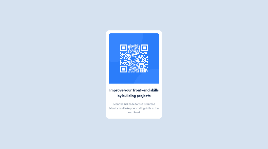
Design comparison
SolutionDesign
Community feedback
- @MelvinAguilarPosted about 2 years ago
Hi @simina 👋, good job completing this challenge, and welcome to the Frontend Mentor Community! 🎉
Here are some suggestions you might consider to improve your code:
- Try to use semantic tags in your code. Click here for more information.:
With semantic tags:
<body> <main class="qr-card"> . . . </main> <body>- Instead of using pixels in font size, use relative units of measure like
remorem. The font size in absolute length units (px) does not allow users with limited vision to change the text size in some browsers. Reference. - The <div> tag defines a division or section on a website. It is used to style a container with CSS, set special alignment, or position content. It might be more efficient to use the <p> tag; the <p> element represents paragraph-level content, usually text:
<p class="qr-description">Scan the QR code to visit Frontend Mentor and take your coding skills to the next level</p>- Add an h1 tag to your solution. The
<h1>element is the main heading on a web page. There should only be one<h1>tag per page. The HTML Section Heading elements (Reference)
Solution:
<h1 class="qr-title">Improve your front-end skills by building projects</h1>I hope those tips will help you.
Good job, and happy coding!
Marked as helpful1@siminaPosted about 2 years ago@MelvinAguilar Thank you for your quick reply and very useful suggestions. I will put them in practice for the future.
0
Please log in to post a comment
Log in with GitHubJoin our Discord community
Join thousands of Frontend Mentor community members taking the challenges, sharing resources, helping each other, and chatting about all things front-end!
Join our Discord
