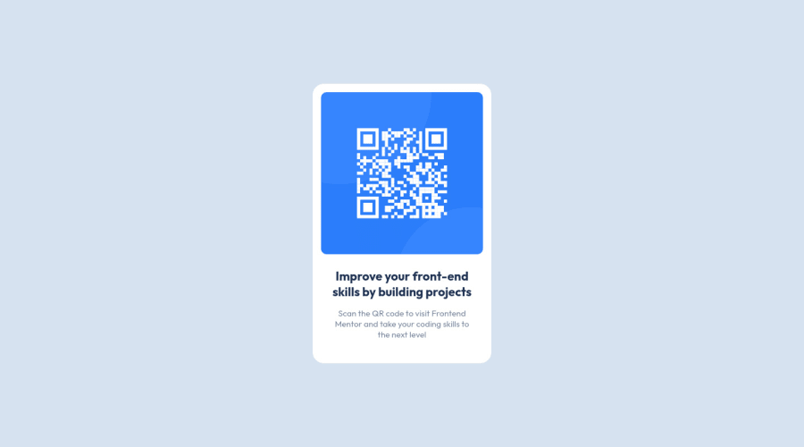
Design comparison
Solution retrospective
This is my 5th Frontend Mentor Challenge... It only took me 30 minutes and it's great for practicing design basics like aligning elements and working with fonts and images.
Community feedback
- @vanzasetiaPosted over 2 years ago
Hi there! 👋
Great work on this challenge! Your solution looks pretty good! 😀
When completing challenges, I recommend avoiding focusing on speed. Instead, focus on quality by testing with keyboards, zoom, and screenreaders. 🙂
Here are some recommendations for improvements.
- I would prefer making the
bodyelement as the main container of the card instead of using themainelement. This way, you can make themainelement as the card element and then remove the extradiv. - Never limit the height of the page (in this case the
mainelement). It will not allow the users to scroll the page if the page content needs moreheight. You can see the issue by looking at the site on a mobile landscape view. So, my recommendation is to usemin-heightinstead. - The card only needs a
max-widthto prevent the card from filling the entire page. So, I recommend setting amax-widthand removing thewidthandheightproperties. For, the height of the card, let the elements inside the card controls it.
Overall, your solution looks great. It's good that you are able to finish this challenge without any media queries.
That's it! I hope you find this useful!
Marked as helpful2@PVIdubsPosted over 2 years ago@vanzasetia Thank you very much for your recommendations... They help me a lot and I'm even applying them in my next project... I thought about the solution of not limiting the height of the page, because when I tried it in a landscape mobile view the design was distorted but I didn't find any solution... I'm already working with those 3 tips in my next project...
0 - I would prefer making the
- @correlucasPosted over 2 years ago
👾Hello @PVIdubs congratulations for your solution!
Your solution is fine and everything is working, you can do an exercise that will help you in your next challenges that is cleaning your code, for example, you can clean the html and css unnecessary divs and classes, all you need is a single
<main>or<div>to keep all the content inside, and nothing more. The ideal structure is thedivand only the image, heading and paragraph.See a clean html structure here:
<body><main><img><h1></h1><p></p></main></body>👋 I hope this helps you and happy coding!
Marked as helpful1@PVIdubsPosted over 2 years ago@correlucas Thank you, your words are much appreciated... I will do that from now on
happy coding too..
1
Please log in to post a comment
Log in with GitHubJoin our Discord community
Join thousands of Frontend Mentor community members taking the challenges, sharing resources, helping each other, and chatting about all things front-end!
Join our Discord
