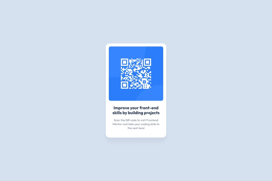
Design comparison
Solution retrospective
I finally completed the first mission. However, I am concerned that the border margin of the QR code image is not uniform. I would appreciate any other advice for further development. Thank you for your help.
and, When I check the file directly on my computer, the title appears correctly as two lines, so why does the title look weird on the screenshot here?
Community feedback
- @frank-itachiPosted over 1 year ago
Hello there 👋. Congratulation for completing the challenge👍!
I have some suggestions about your code that might interest you.
CSS 🎨:
- Avoid using absolute length units px, especially for font-size and width properties, because they are not relative to anything else so that means they will always be the same size. Instead, you can use relative lengths like em or rem. The benefit of that last one is element which has that unit will scale relatively to everything else within the page, e.g., the parent container. You can dig up about it here.
I hope you find it useful! 😄 Above all, you did a good job!
Happy
<coding />😎!Marked as helpful2@eunjikimdevPosted over 1 year ago@frank-itachi
Thanks for your help, I took your advice and studied about em and rem and modified my project accordingly. I'm excited to improve my coding skills. Thank you! <3
0 - @MelvinAguilarPosted over 1 year ago
Hello there 👋. Good job on completing the challenge !
I have some suggestions about your code that might interest you.
- The <br> tag is often used to create line breaks, but it doesn't convey any semantic meaning. When a screen-reader reads the text, it will break the flow of reading at the line break tag, which can be confusing for users.
Font 🔤:
-
"why does the title look weird on the screenshot here?" - The @import rule that you're using to import the Google Font is not correct.
Currently, all browsers apply different default font-family, so it's important to specify a font-family in your CSS to ensure that the correct font is used on all platforms. Check your solution in Chrome and then in Firefox, and they look completely different.
To import a font, follow the steps below:
- Go to the font's page on Google Fonts: https://fonts.google.com/specimen/Outfit.
- A sidebar will appear with a code snippet that you can use to import the font.
- Copy this code snippet and paste it into the css code.
- Now you can use the "Outfit" font in your CSS by specifying
font-family: 'Outfit', sans-serif;.
The correct @import rule to import the "Outfit" font from Google Fonts with multiple weights would be:
@import url("https://fonts.googleapis.com/css2?family=Outfit:wght@400;500;600;700;900&display=swap");
I hope you find it useful! 😄
Happy coding!
Marked as helpful1@eunjikimdevPosted over 1 year ago@MelvinAguilar
Thanks for the help, I took your advice and deleted the <br> tag, and fixed the font code snippet. I didn't realize this was wrong until you pointed it out! Thank you so much for your help. I finally have a two-line title now haha <3
0
Please log in to post a comment
Log in with GitHubJoin our Discord community
Join thousands of Frontend Mentor community members taking the challenges, sharing resources, helping each other, and chatting about all things front-end!
Join our Discord
