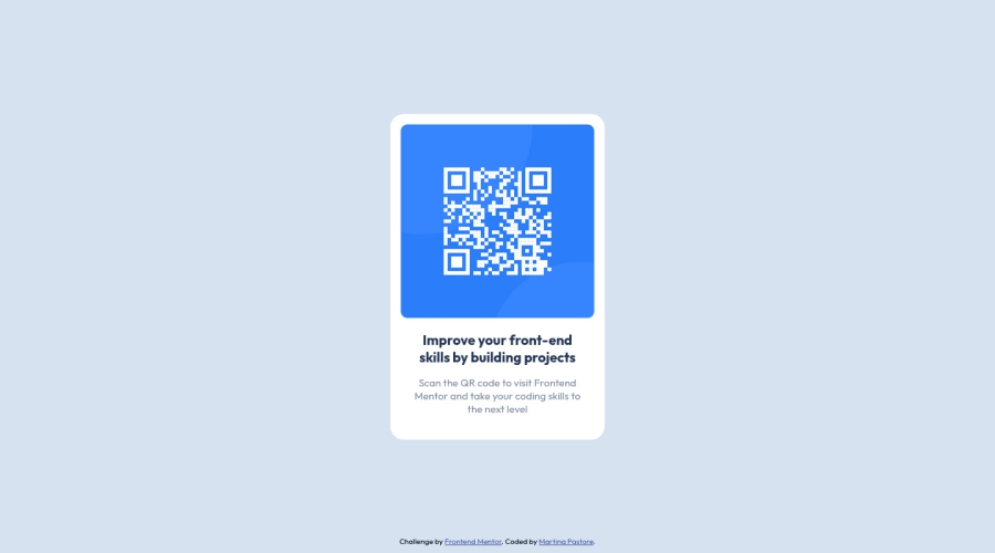
Design comparison
Community feedback
- @MelvinAguilarPosted almost 2 years ago
Hello 👋. Congratulation on successfully completing your first challenge 🎉 ! !
I have some recommendations regarding your code that I believe will be of great interest to you.
CSS 🎨:
- Instead of using pixels in font-size, use relative units like
emorrem. The font-size in absolute units like pixels does not scale with the user's browser settings. Resource 📘.
-
Avoid using
position: absoluteto center an element as it may result in overflow on some screen sizes. Instead, utilize the flexbox or grid layout for centering. Get more insights on centering in CSS here here 📘.
I hope you find it useful! 😄 Above all, the solution you submitted is great!
Happy coding!
Marked as helpful1@PastoreMartinaPosted almost 2 years ago@MelvinAguilar Thank you for your helpful feedback!
I tried to implement your suggestion, centering the element using flexbox. However, I'm not entirely satisfied with the result. I'd like to keep the card in the center of the screen while pushing the attribution at the bottom, but I'm having a hard time figuring it out. I'll try submitting a new solution asking the community for specific feedback on this subject.
Thank you again!
0 - Instead of using pixels in font-size, use relative units like
Please log in to post a comment
Log in with GitHubJoin our Discord community
Join thousands of Frontend Mentor community members taking the challenges, sharing resources, helping each other, and chatting about all things front-end!
Join our Discord
