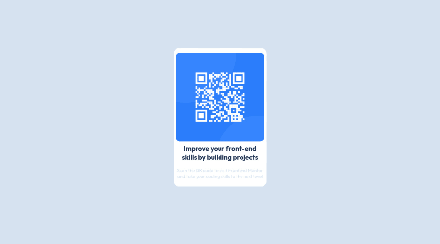
Design comparison
SolutionDesign
Solution retrospective
I would love someone's feedback. If I have made any mistakes.
Thank You.
Community feedback
- @Sonu-DuttaPosted almost 3 years ago
Hey! Congratulations 🎉 on completing this challenge! Try to center the main container by using flex -property (justify-content: center and align-items: center) Hop this helps!
Happy coding 😊
Marked as helpful2@rouftarekPosted almost 3 years ago@Sonu-Dutta Hi, Thank you for your help. I have used the flex property but for some reason it is not working. Maybe I am missing something. I will try to fix it. Thanks again.
1@Sonu-DuttaPosted almost 3 years ago@rouftarek Set the height as 100vh of the parent container ..hope it works!
Marked as helpful0 - @EmmanuelHexerPosted almost 3 years ago
Great work man. Nice one
Marked as helpful1
Please log in to post a comment
Log in with GitHubJoin our Discord community
Join thousands of Frontend Mentor community members taking the challenges, sharing resources, helping each other, and chatting about all things front-end!
Join our Discord
