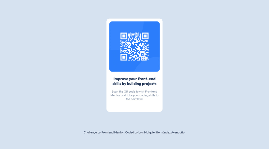
Design comparison
Solution retrospective
You are using the <figure> tag and the <article> tag incorrectly. Since its characteristics do not lend themselves to that project. Are not necessary.
I think I could improve some classes so as not to duplicate my CSS
Please friends, inspect my code and be harsh in terms of criticism, only then will I improve. Thanks so much.
Community feedback
- @Sdann26Posted over 2 years ago
Hola Luis!
Las recomendaciones anteriores te deben haber servido para lograr tu reto al 100% aun no has puesto lo de la etiqueta <main> en ves de <section> pero apenas lo hagas generá un nuevo reporte para que salgan 0 errores en tu reporte de frontend mentor.
En lo personal te quería recomendar aprender metodología BEM, ya que te ayudará a no pensar demasiado tus clases, hacer clases entendibles, tener un mismo idioma en tu equipo de como manejar las clases, se usa muy bien con SASS, etc. Esta tipo de metodología es bastante sencilla y te puede servir un monton para tus proyectos ya cuando adquieras más experiencia puedes ir agregando más cosas o buscan diferentes metodologías.
Si tienes alguna duda no dudes en consultar.
Marked as helpful0@MixhetlPosted over 2 years ago@Sdann26 Si. Justo estudiare esta semana. :D. Ya estoy haciendo los cambios.
1 - @xsaulPosted over 2 years ago
Hola Luis, en general hiciste un gran trabajo! Chequé tu CSS y le hice unos cambios para hacerlo más parecido al diseño original. Puedes revisarlo y decirme tu opinión!
Tu carta yo la veía un poco más larga entonces le reduje la altura y le aumenté el ancho. También le cambié el margen para que de esa manera tu sitio no tenga una barra para hacer scroll.
.card{
width: 325px; height: 475px; margin: 50px auto;
}
Con los cambios hechos a la carta la imagen se veía mucho más grande que el texto, entonces también le reduje el ancho.
.img{
width: 95%;
}
Usando el margen de esta manera ambos parrafos van a estar alineados. Usando "20px auto" centrarías el segundo parrafo.
.title{
margin: 20px;
}
Y hablando sobre tu duda. En este diseño cada elemento tiene diferentes propiedades entonces no hay manera de crear clases que se puedan reutilisar.
Marked as helpful0@MixhetlPosted over 2 years ago@xsaul Muchas gracias por tomarte el tiempo de revisare mi solución :D. Aplicare esto.
1 - @Bayoumi-devPosted over 2 years ago
Hey Luis, It looks good!... You have an
accessibility issue
that needs to fix.Document should have one main landmark
, Contain the component with<main>
.
<main> <section class="card"> //... </section> </main>
- I suggest you center the component on the page with
Flexbox
, by giving the parent element<main>
the following properties:
main { display: flex; justify-content: center; align-items: center; min-height: 100vh; } .card { //... /* margin: 100px auto 100px; <--- Remove */ }
Your code is clean Hope this is useful to you... Keep coding👍
Marked as helpful0@MixhetlPosted over 2 years ago@Bayoumi-dev Thank you very much. I did it. :D
0
Please log in to post a comment
Log in with GitHubJoin our Discord community
Join thousands of Frontend Mentor community members taking the challenges, sharing resources, helping each other, and chatting about all things front-end!
Join our Discord