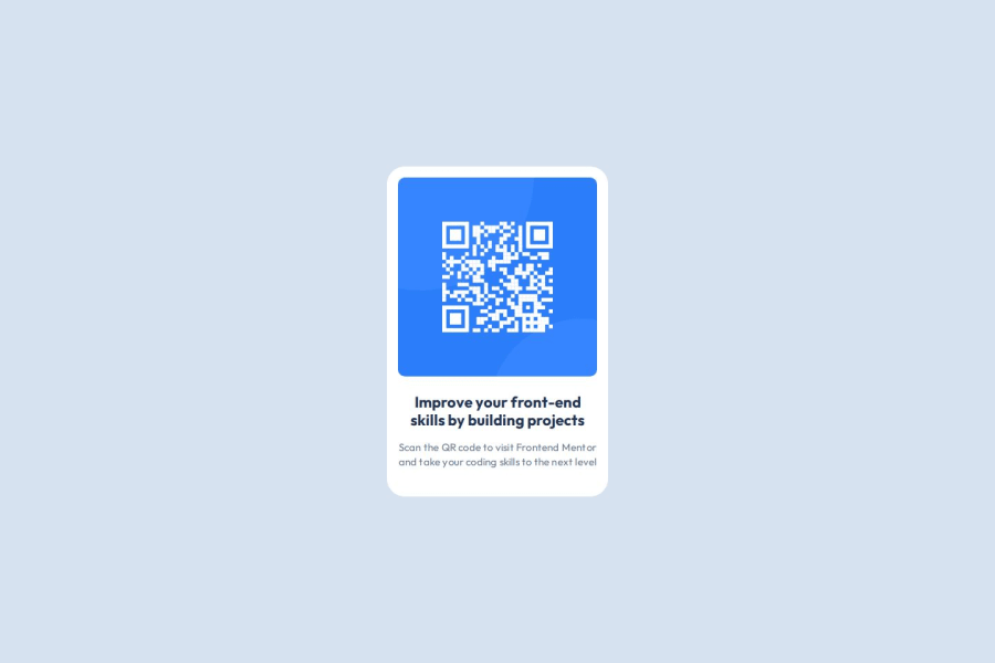
Design comparison
Solution retrospective
I set up a Vue project with SCSS from scratch. I implemented the exercise in a Vue component and organized the global SCSS in a specific folder structure.
I've learned how to calculate the inner and outer border-radius and used this technique in this project:
What challenges did you encounter, and how did you overcome them?.qr-code-card { --padding: var(--spacing-200); --inner-border-radius: 10px; padding: var(--padding); border-radius: calc(var(--inner-border-radius) + var(--padding)); img { border-radius: var(--inner-border-radius); } }
Challenging was to find every detail in the Figma template. However, this exercise was still simpel, so in the end I was able to recreate everything.
What specific areas of your project would you like help with?I didn't understand how to deal with the typography.
I was able to use the design system for the colors and the spacing like so:
html {
  --color-white: hsl(0deg 0% 100%);
  --color-slate-900: hsl(218deg 44% 22%);
  --color-slate-500: hsl(216deg 15% 48%);
  --color-slate-300: hsl(212deg 45% 89%);
}
html {
  --spacing-500: 2.5rem;
  --spacing-300: 1.5rem;
  --spacing-200: 1rem;
}
I just applied the typography related CSS declarations to the individual HTML elements like so:
body {
  font-family: 'Outfit', sans-serif;
}

.heading {
  font-size: 1.375rem;
  line-height: 1.2;
}

p {
  font-size: 0.9375rem;
  line-height: 1.4;
  letter-spacing: 0.2px;
}
Is it beneficial in this exercise to utilize a design system also for the typography? I don't know how to do that. How would you do it?
In the provided style guide the typography is documented like so:
Text Preset 1: Outfit Bold
22px
120% Line Height
0px Letter Spacing

Text Preset 2: Outfit Regular
15px
140% Line Height
0.2px Letter Spacing
Community feedback
Please log in to post a comment
Log in with GitHubJoin our Discord community
Join thousands of Frontend Mentor community members taking the challenges, sharing resources, helping each other, and chatting about all things front-end!
Join our Discord
