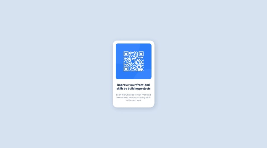
Design comparison
Solution retrospective
This one was pretty easy had no problem doing this project
Community feedback
- @ChamuMutezvaPosted over 1 year ago
Hi KYLE.
Nice work Kyle, here are a few recommendations
- the HTML looks good, you will need to make use of Landmark elements which are a powerful way to organise the structure of your webpage. Such elements include the
header, main and footer. Find out more on MDN or an other resources. - the alt value for the image should be readable text that should be able to help users when the image fails to load or for the benefit of assistive tech users.
- Font sizes should be in values such as rem or em, the following article is a good article on Why font-size must NEVER be in pixels
- explicit width can be tricky to handle , like in the following example on the card
width: 350px;. If my device has a width of 320px that will not be presented because of the explicit width mentioned earlier - such situations are handles well using amax-width. This particular challenge does not need amedia query, if you set the card to the maximum width it should take (in rems) , egmax-width: 26rem, the card will scale accordingly on all device sizes but will never exceed 26rem. You may need to add some padding on the container in order to leave some space if needed. - Check out my solution here
0 - the HTML looks good, you will need to make use of Landmark elements which are a powerful way to organise the structure of your webpage. Such elements include the
Please log in to post a comment
Log in with GitHubJoin our Discord community
Join thousands of Frontend Mentor community members taking the challenges, sharing resources, helping each other, and chatting about all things front-end!
Join our Discord
