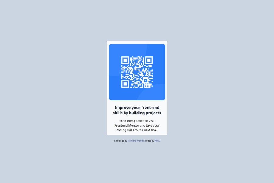
Design comparison
SolutionDesign
Community feedback
- @tristanjtatePosted 5 months ago
Your design looks great and very nice job making it responsive! I see you used tailwind css for this project, and that's awesome! I just starting learning/using tailwind and I am enjoying it. There are a few areas of improvement that I want to mention:
Color/font
- Needs to match the design more closely
- edit tailwind config file to implement desired styles that you can use with tailwind(in general, how you can adjust certain things whether that's color, fonts etc within your config file) to implement into your html
- below is just an example of how I am setting random colors and fonts within my config file
module.exports = {
  content: ["./src/**/*.html"],
  theme: {
    extend: {
      colors: {
        "my-orange": "hsl(25, 97%, 53%)",
        "very-dark-blue": "hsl(216, 12%, 8%)",
        "my-light-grey": "hsl(217, 12%, 63%)",
        "my-dark-blue": "hsl(213, 19%, 15%)",
        "my-black": "hsl(231, 6%, 4%)",
      },
      fontFamily: {
        overpass: ["Overpass", "sans-serif"],
      },
    },
  },
  plugins: [],
};
Border-radius
- needs to be more rounded
- Review tailwind documentation or find a "Tailwind CSS Cheat sheet"
- Border-radius Tailwind Documentation
These were just a couple of things I think that can be improved upon. Overall, great work and honestly very cool for using Tailwind!
Marked as helpful0
Please log in to post a comment
Log in with GitHubJoin our Discord community
Join thousands of Frontend Mentor community members taking the challenges, sharing resources, helping each other, and chatting about all things front-end!
Join our Discord
