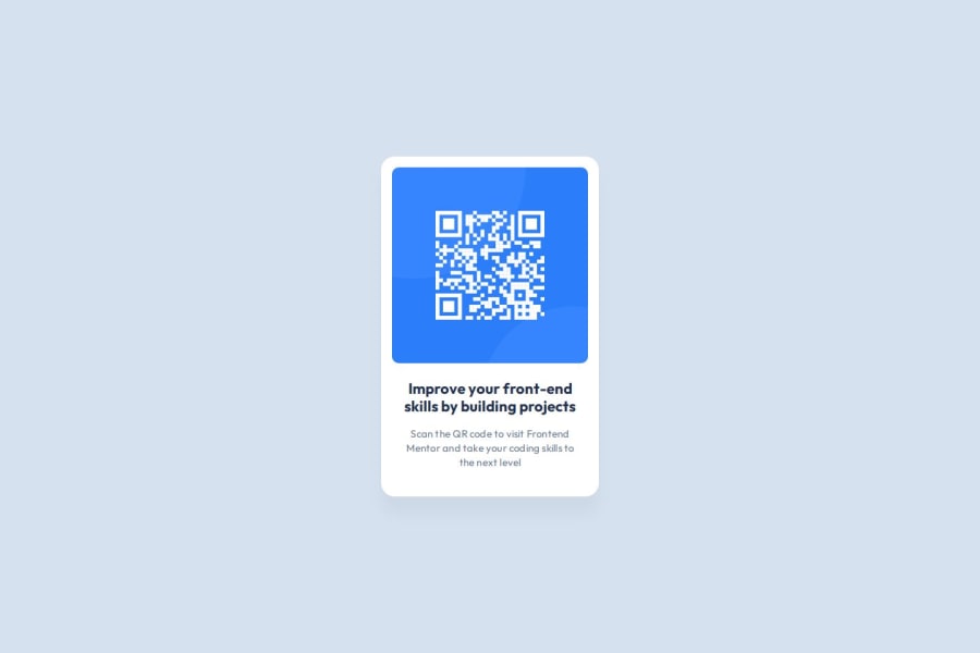
QR Code Component using TailwindCSS
Design comparison
Solution retrospective
I've always had some sort of struggle centering HTML elements. In previous projects of mine, I usually set the :root and/or the body with a static height of screen then set the main with a h-full or height: 100%;. However, I've never been a fan of this approach. Through Kevin Powell's teachings (and other learning I've done), I've always wanted to use min-height, but could never really understand how to utilize this to my advantage. Since this is a simple project, I set out to figure out how to use incorporate min-height, and I did! This is how I accomplished it: ``
I was also pretty proud of using the max-w-min utility class within the component styling itself.
As well, through this project I was able to re-vamp my knowledge of the Tailwind configuration settings to allow myself to override the Tailwind default color scheme with only the colors I needed to produce the QR code component.
Realistically, I think the only thing I would do differently next time is build this with plain CSS, no Tailwind. However, I do really like using Tailwind.
What challenges did you encounter, and how did you overcome them?Design to code is HARD. I relied heavily on the Figma file provided with this course to produce the result of the QR code component. I understand that in the real world, this is ultimately not a cause for concern, as developers will need to adhere to design constraints set by the designers. However, most of my projects are built by me and me alone, and I'm not the most confident in design in general. I need to study more design principles and also look at examples to find easy ways to be able to translate design into code. I know this will come with practice and time, but it's something I still need to recognize as a weakness to build upon.
As well, I feel that I could've done more with the Tailwind configuration to adhere to the style guide. While I did use it to leverage the typography and color scheme, I feel it would've also been beneficial to leverage it for the spacing/sizing constraints as well, as I did end up using a lot of the arbitrary value classes within this project.
What specific areas of your project would you like help with?- Is my centering method utilizing CSS Grid and the min-height property valid?
- How would you approach design to code with only the images and style guide? Would you try to mock it out in a wireframe first based on the style guide? What are the best approaches you've found?
Community feedback
Please log in to post a comment
Log in with GitHubJoin our Discord community
Join thousands of Frontend Mentor community members taking the challenges, sharing resources, helping each other, and chatting about all things front-end!
Join our Discord
