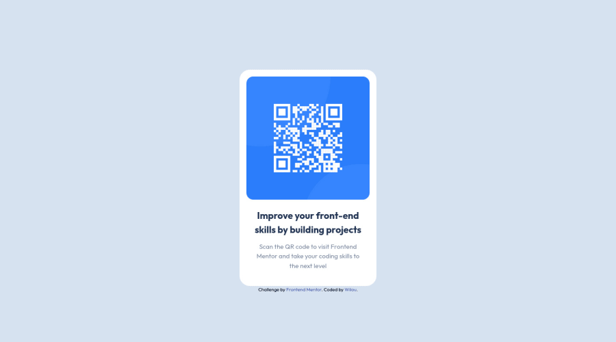
Design comparison
Solution retrospective
Hello, I complete this challenge using TailwindCSS.
Community feedback
- @correlucasPosted about 2 years ago
👾Hello @Wilouricard, Congratulations on completing this challenge!
Great solution and great start! By what I saw you’re on the right track. I’ve few suggestions to you that you can consider to add to your code:
1.Use units as
remoreminstead ofpxto improve your performance by resizing fonts between different screens and devices. These units are better to make your website more accessible. REM does not just apply to font size, but to all sizes as well.2.Use
<main>instead of<div>to wrap the card container. This way you show that this is the main block of content and also replace the div with a semantic tag.3.Don’t use
idto give the style of your elements, it's not a good idea becauseidis a too specific selector used forformsand Javascript code. Instead, useclassfor styling and let theidfor much specific stuff. It's also not advisable to use IDs as CSS selectors because if another element in the page uses the same/similar style, you would have to write the same CSS again. Even if you don't have more than one element with that style right now, it might come later.✌️ I hope this helps you and happy coding!
Marked as helpful0@WilouricardPosted about 2 years ago@correlucas Thank you very much for your advice, I will make the changes
Wilou
0
Please log in to post a comment
Log in with GitHubJoin our Discord community
Join thousands of Frontend Mentor community members taking the challenges, sharing resources, helping each other, and chatting about all things front-end!
Join our Discord
