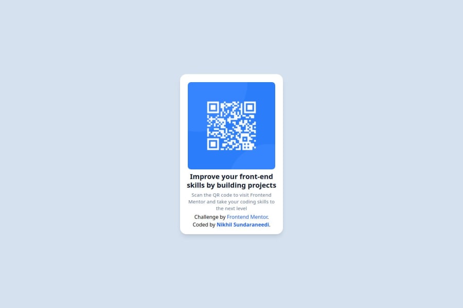
Qr Code Component using Tailwind CSS
Design comparison
Solution retrospective
I am most proud of successfully implementing a clean and responsive design using Tailwind CSS. Ensuring the QR code component was centered properly and achieving a visually appealing layout with precise spacing and typography was a great learning experience.
Next time, I would focus on:
- Enhancing accessibility by adding ARIA labels and improving color contrast.
- Experimenting with animations to make the UI more engaging.
- Exploring alternative styling approaches, such as CSS Grid or utility classes, to refine layout flexibility.
One of the main challenges I faced was centering the QR code component perfectly on the page while ensuring proper spacing between elements. Initially, I struggled with extra space between the image and text, but I resolved it by adjusting margin, padding, and flex properties in Tailwind CSS.
Another challenge was fine-tuning typography and spacing, especially combining letter-spacing and line-height while keeping the design visually balanced. I overcame this by experimenting with Tailwind’s text and spacing utilities, making small adjustments until I achieved the desired look.
I also faced minor issues with vertical alignment due to h-screen, which pushed elements down unexpectedly. By restructuring my layout and removing unnecessary height properties, I ensured the card was centered properly.
A huge thanks to ChatGPT for providing quick guidance and helping me debug layout issues efficiently! 🚀
Community feedback
Please log in to post a comment
Log in with GitHubJoin our Discord community
Join thousands of Frontend Mentor community members taking the challenges, sharing resources, helping each other, and chatting about all things front-end!
Join our Discord
