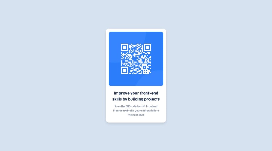
QR Code Component using Tailwind CSS
Design comparison
Solution retrospective
This is the first time I'm using Tailwind CSS after the crash course I took.
What challenges did you encounter, and how did you overcome them?I was having trouble importing the Outfit font from Google Fonts in my source CSS file. I added it as a link in the head tag as an alternative.
What specific areas of your project would you like help with?Any suggestions on how I can improve my use of TailwindCSS in this project are welcome. I would also like to know I we can import a font using a remote URL in the main CSS file.
Community feedback
- @JoramirJrPosted about 1 year ago
Hi, @SidharthSreekumar!
One easy step to center your container would be to first define its margin to 0, then the 'height' of the body to '100vh'; after that, by defining 'display: grid' and 'place-items: center' to the body, your card would be centered!
Hope its helpful!
Marked as helpful0@SidharthSreekumarPosted about 1 year agoHello @JoramirJr,
Thanks for the suggestion. I usually use display: flex with align-items: center and justify-content: center to center items vertically and horizontally. However, in this challenge, I failed to know that the component placement mattered. I thought I only had to concentrate on the component. I will try the method you mentioned. Thanks again for your feedback.
1 - @LMCyberPosted about 1 year ago
I recommend using the following to center all the conten:
body { font-family: var(--primaryFont); background-color: var(--lightGray); display: grid; place-content: center; height: 100vh; }
Marked as helpful0
Please log in to post a comment
Log in with GitHubJoin our Discord community
Join thousands of Frontend Mentor community members taking the challenges, sharing resources, helping each other, and chatting about all things front-end!
Join our Discord
