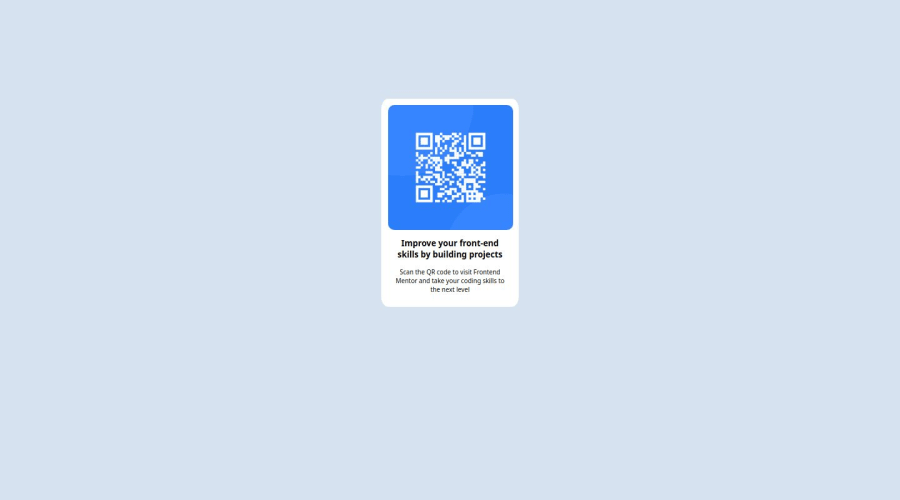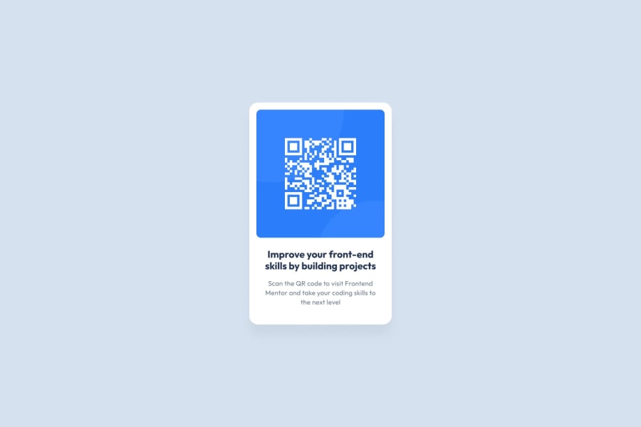
Design comparison
Solution retrospective
As a complete beginner in the world of Front end development i am extremely proud i could finish firstly finish my project and secondly being able to finish my project without any framework. Only html and css.
What challenges did you encounter, and how did you overcome them?Finding the correct padding and the correct css attribute was maybe the greatest challenged i encountered.
What specific areas of your project would you like help with?The deployment of my project on github did not give me the exact result i had, when deploying locally. I would like help to understand if it is due to my code or if it is normal.
Community feedback
- @grace-snowPosted 7 months ago
I'm afraid there are quite a lot of problems in this that will need re-writing. Don't worry though they're all very usual things that come up when people are first starting out. I'll try to list them out one by one.
- update the
titleof the page in the html head. - all content should be contained within landmarks. They are a specific type of element that communicated the core structure of Web pages. In challenges like this that are not full pages and only a single component demo, all you need is a
mainlandmark to wrap the component (the card). - stop wrapping everything in divs!! You've added so many on here and it's all unnecessary. This is a simple card with an image, heading and paragraph inside. That's one div with a few elements inside, no more complexity is needed. As well as making the code complex and difficult to read it's making the styling way more difficult than it needs to be.
- this image is really important content so it needs a good alt description. That needs to say what it is (QR code) and where that goes (to FrontendMentor.io). There are some great posts about how and when to write alt text on images in the resources channel on discord.
- heading elements are really important for communicating the structure of a Web page to various other technologies. Headings should be in a logical order, hierarchical, because their job is to show what content belongs to what. Heading levels have absolutely nothing to do with the text size of a heading in the design, they are all about semantics. It's extremely unlikely this heading would be a h5 as that means it belongs to some h4 content that belongs to some h3 content and so on... I'd make this a h2 as h1s are for page titles (which this component wouldn't be) and if in doubt it's always going to be better to choose a more important level over a less important one.
- moving on to CSS... Get into the habit straight away of always including a full modern css reset at the start of the styles in every project. Andy Bell or Josh Comeau both have good ones you can look up and use.
- to center a component on the screen (or to build any layouts in fact) don't try and use huge paddings or margins. All this needs is some flex properties on a wrapping element and a min-height of 100vh (or svh). You could put those properties on the body in this, or on main.
- the card must not hage a width. This is a really important approach to grasp when thinking about building responsively. Instead use max-width so the card can only grow up until that set limit, but it can also shrink narrower when it needs to (like on smaller screens). You can give it width 100% if you like as well as the max width, but don't ever give it a width with a pre-defined value.
- that max-width should be in
remtoo. That means the layout would scale correctly for all users, including those with a different text size setting. basically, if someone had a text size setting of 200% (32px) you would want them to see a card that is also scaled up for them, which is what happens when that max width is in rem. If it was in px that person would see huge text squished into a very narrow card. - there is no reason for the card to display flex in this unless you're planning on making it a column and using the gap property.
- the card should have padding, not the image. Make sure you understand the difference between padding and margin.
- all the image needs in this is what's included in any standard css reset - display block and max-width 100%. You can give it a width of 100% too if you like and of course add the border radius. But there is no need or benefit to using flex on this image. In fact I've just notices that may be styles on a wrapping element which as I already said isn't needed at all.
- I recommend generally against using % for border radius as its a bad habit that can lead to bugs. The only time you'll want that is on circular or square images. so it's OK in this case but just be warned it's often not the right unit to choose there.
- don't use key words for font size. That loses all control. The style.guide said what font size to use on the body (which would be inherited by the paragraph). You just need to convert that style guide px Value to rem so you can use it in the code.
- really stop over using flex. Only use it when you need it for a specific purpose!
- beware using percentage for padding. Again you can lose control easily as you wont know what that equates to. Choose an appropriate unit for the task at hand.
- you need to import the font(s) and weights you need. Pay close attention to details in designs. A designer wouldn't be happy if you chose different fonts or sizes to their design.
I hope all this helps. You should be able to get your solution much closer to the design now and improve the code quality. Good luck.
Marked as helpful1@ndenbefPosted 7 months agoHello @grace-snow. I am really greatful you took the time to view and explain what was wrong with my solution. I realise now how much work i have now. Thank you.
0 - update the
Please log in to post a comment
Log in with GitHubJoin our Discord community
Join thousands of Frontend Mentor community members taking the challenges, sharing resources, helping each other, and chatting about all things front-end!
Join our Discord
