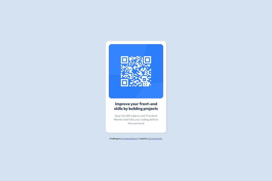


Design comparison
SolutionDesign

Solution retrospective
What are you most proud of, and what would you do differently next time?
🛠️ Built with:
-HTML 🧾 -SASS 🎨 -BEM Notation 🅱️
I’m most proud of reinforce good coding habits with the correct use of landmarks and semantic HTML. Also finding solutions to the problems I encountered with the deployment in Github Pages with Sass.
What challenges did you encounter, and how did you overcome them?I learned:
- To convert pixels to rems using
@function rem($pixel) - How to have a responsive card container with min() function. If the second value is the smallest, 100% of the vh minus the total space on the sides is calculated.
.card {
  width: min(u.rem(315), calc(100% - u.rem(22)));
  margin-inline: auto;
}
- To self-host with @fontface (Google fonts).
- To center a component in the viewport with flex.
body {
  /* center */
  display: flex;
  justify-content: center;
  align-items: center;
  /* reset */
  min-height: 100vh;
}
I would like to know if there is a better way to center a component and if there are other best practices missing. Any feedback is highly appreciated 🌟
Community feedback
Please log in to post a comment
Log in with GitHub
Join our Discord community
Join thousands of Frontend Mentor community members taking the challenges, sharing resources, helping each other, and chatting about all things front-end!
Join our Discord