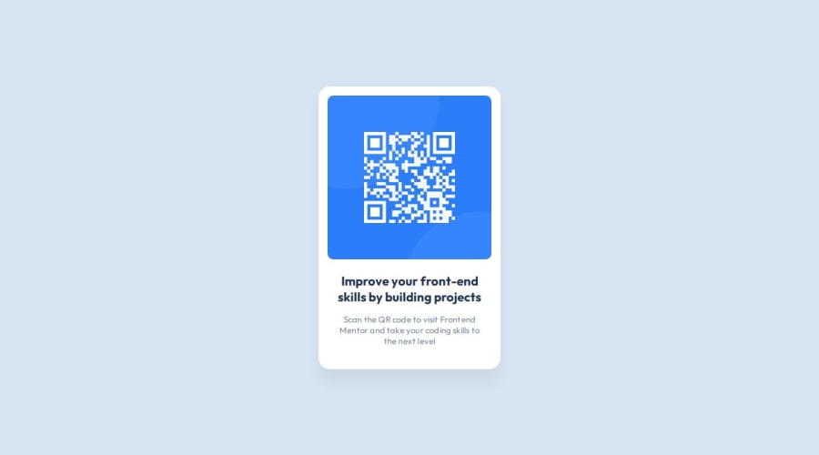
Design comparison
SolutionDesign
Solution retrospective
What are you most proud of, and what would you do differently next time?
I'm proud of how I divided the Sass files by responsibility and my usage of functions / mixins. I'm getting started with Sass and I'm happy that I managed to use some of its functionalities in this project.
What challenges did you encounter, and how did you overcome them?Getting around Figma, I watched some tutorials on the UI and how to approach it.
What specific areas of your project would you like help with?I'm not happy with my markup. I'm afraid I overused divs and that could hurt accessibility. Semantic markup is important and I haven't managed to use it properly in this particular project.
Community feedback
Please log in to post a comment
Log in with GitHubJoin our Discord community
Join thousands of Frontend Mentor community members taking the challenges, sharing resources, helping each other, and chatting about all things front-end!
Join our Discord
