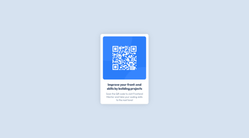
QR Code Component using React and Styled Component
Design comparison
Solution retrospective
I find it difficult to adjust the size of the image and fonts to follow the design provided and it is also challenging to create a card component using styled component
Community feedback
- @PeshwariNaanPosted almost 2 years ago
Hello and good job on completing the challenge.
Here are a few tips that might help you with your code.
-
Be careful not to skip over heading levels ion your css. This means that you don't want to start with an
<h2>
if you don't have an<h1>
already in your code. Start with the<h1>
then move to<h2>
and the<h3>
etc. So your card title needs to be changed to an h1 to get rid of the error. -
Make sure to wrap your root div with a
<main>
tag for accessibility. You can do this in the index.html file like below and it will get rid of your error.
<main> <div id="root"></div> </main>
-
Make sure to include an alt prop on your image wrapper component. The alt should have a description of the image. In your case this would be something like alt="QR code that directs user to frontend mentor site".
-
The styled components can take a little while to get used to but don't give up. It is a very powerful tool. Be careful that you don't have styling that overlaps other styling in different components. Always try to keep things as simple as you can.
-
Start working with em or rem units in your styling rather than px units. This helps people with vision problems to adjust their devices. You can read about it HERE.
I hope this helps - Happy coding 😁
Marked as helpful0@natanaelrusliPosted almost 2 years ago@PeshwariNaan Hello, Thanks for the feedback! really helps a lot and add depth to my front end knowledge. Happy Coding!
0 -
Please log in to post a comment
Log in with GitHubJoin our Discord community
Join thousands of Frontend Mentor community members taking the challenges, sharing resources, helping each other, and chatting about all things front-end!
Join our Discord