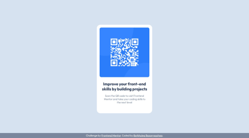
Submitted over 1 year agoA solution to the QR code component challenge
QR code component using just HTML and CSS
@BataaB

Solution retrospective
What are you most proud of, and what would you do differently next time?
I think this project was straightforward. I have applied what I just learned in CSS. The Desktop and Mobile versions seemed identical so I didn't make changes.
What challenges did you encounter, and how did you overcome them?I wasn't sure what method would be more appropriate for centering certain elements. So, I just applied what I learned and I think it looks close enough.
Code
Loading...
Please log in to post a comment
Log in with GitHubCommunity feedback
No feedback yet. Be the first to give feedback on Bryan's solution.
Join our Discord community
Join thousands of Frontend Mentor community members taking the challenges, sharing resources, helping each other, and chatting about all things front-end!
Join our Discord