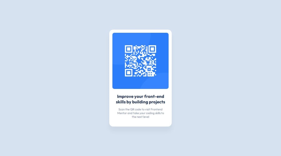
Design comparison
SolutionDesign
Solution retrospective
What are you most proud of, and what would you do differently next time?
With this being my first project, I'm most proud of how I worked through various issues to make my code create an output like the reference image.
Next time, I want to try using CSS variables instead of copying the same color codes multiple times.
What challenges did you encounter, and how did you overcome them?The box shadow wasn't appearing, but then I realized I had formatted the values incorrectly
What specific areas of your project would you like help with?This is my first project, so my code might not be the most efficient or organized. Any tips on achieving the same result but with less code / alternative approaches would be appreciated!
Community feedback
Please log in to post a comment
Log in with GitHubJoin our Discord community
Join thousands of Frontend Mentor community members taking the challenges, sharing resources, helping each other, and chatting about all things front-end!
Join our Discord
