Not Found
Not Found
Not Found
Not Found
Not Found
Not Found
Not Found
Not Found
Not Found
Not Found
Not Found
Not Found
Not Found
Not Found
Not Found
Not Found
Not Found
Not Found
Not Found
Not Found

Submitted

QR Code Component using HTML/CSS

@NotNotEvan

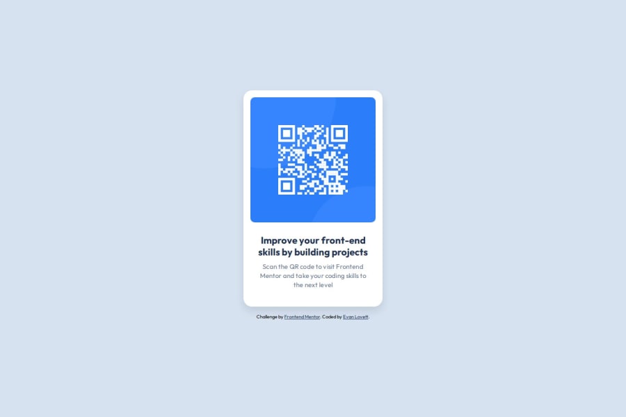
Desktop design screenshot for the QR code component coding challenge

This is a solution for...

  • HTML
  • CSS
1newbie
View challenge

Design comparison


SolutionDesign

Solution retrospective


What are you most proud of, and what would you do differently next time?

This was a great refresher on basic HTML/CSS. For my day job I typically use MUI components - so, although the CSS is syntactically similar, it was great to get back to the roots and write basic CSS outside of an sx prop. For the next project, I think I'll have an overall better approach to styling the various elements of the page because of this project.

What challenges did you encounter, and how did you overcome them?

My biggest challenges came from writing in vanilla HTML/CSS again. It's been roughly a year since I've worked in these languages to build a webpage, so that was slightly challenging at times. I overcame this by researching/reading articles - big thank you to the authors of articles on Medium!

What specific areas of your project would you like help with?

No specific areas. However, any feedback is greatly appreciated!

Community feedback

T
Grace 30,670

@grace-snow

Posted

Hi & well done on completing the first draft! This looks pretty good but there are a few problems and a few learnings to apply.

  • try to think of this as a single component that could be dropped into a website on any page. With that context in mind, it highlights some things. Like the alt text on the image should describe what the image is (QR code) and where it goes (to FrontendMentor.io).
  • similarly, this card would never be used to serve the main heading on a page. So you know it shouldn't have a h1. Use a lower importance heading level like h2 instead.
  • remove the inline styles from the html. Styles belong in the css. You don't want to end up with a mish mash of css styles and inline styles.
  • if links open in a new window/ tab like those in the footer, make.sure you warn screen readers. Usually that's done with some sr-only text in a span inside the link or via the title attribute saying something like "(opens in a new tab)".
  • get into the habit of including a full modern css reset at the start of the styles in every project. Andy Bell or Josh Comeau both have good ones you can look up and use.
  • This solution is getting badly cropped on some screen sizes because the height of the body has been limited with a height property. You never want to limit the height of elements that contain text, including the body. Instead of height 100dvh, use min-height and I think svh will work better for performance.
  • similarly, the card must not have a limited height. Remove the max height property from the component. Let the browser do it's job and decide what height is needed based on the content and any vertical spacings inside.
  • the body doesn't need it's width setting either. The body is already full width, which is exactly what you want so there is no need for extra.
  • change the component max width to rem instead of px. That way, if end users have a different text size the layout will scale nicely. If you leave the max width in px the end result for those people could be a narrow card with huge text squished inside it.

Marked as helpful

1

T
Grace 30,670

@grace-snow

Posted

@NotNotEvan this looks better, but I have a couple more questions / suggestions.

  1. Why is the heading level as low as h4? It makes me wonder if you understand heading hierarchy and why it matters. It may be fine, but you would need to be clearly envisioning a page design that already had a h2 and h3 above it, all pertaining to this content. It's very rare I've worked on designs that even need headings as low as h4.
  2. This card is touching the edges of the screen on all sides at some screen sizes. Add a little padding to a wrapping element (like body in this case) so that can't happen. I'd use px for that (or a min() function with px and vw) as you wouldn't want it to change with the users text size.
  3. Something to consider when it comes to unit choice: I wouldn't recommend using pixels for margin top on the text elements like this. If you used em it would be relative to that element's font size; or if you used rem it would be relative to the root browser font-size. The benefit of using a responsive instead of a fixed unit is that this vertical spacing would scale along with the user's chosen text size (in their browser or device).
0

Please log in to post a comment

Log in with GitHub
Discord logo

Join our Discord community

Join thousands of Frontend Mentor community members taking the challenges, sharing resources, helping each other, and chatting about all things front-end!

Join our Discord