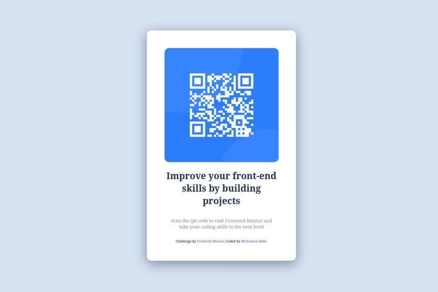
Design comparison
SolutionDesign
Solution retrospective
What are you most proud of, and what would you do differently next time?
After long time of learning again and again html/css, it was my first time of doing hands on project although its basic one.
What challenges did you encounter, and how did you overcome them?I have not seen alot of challenges.
Community feedback
- @BeenjminPosted about 1 month ago
The solution has some differences compared to the original. Some of them are mentioned below:
- The font on the page is not the same. Looking at the code, it was missing the proper font inclusion in the HTML.
- The image has too much space from the container's border, requiring adjustments to the image's margin and padding.
- The text is too large for the container, needing adjustments to the font size. Additionally, the accompanying paragraph is too small, not following the style guide.
0
Please log in to post a comment
Log in with GitHubJoin our Discord community
Join thousands of Frontend Mentor community members taking the challenges, sharing resources, helping each other, and chatting about all things front-end!
Join our Discord
