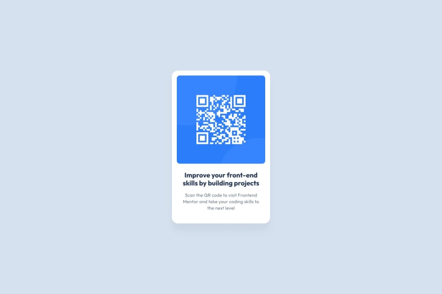
Design comparison
SolutionDesign
Community feedback
- @DanCodeCraftPosted 9 months ago
Very well done and close to the original!
If anything I can add, that the bold text is slightly bigger, almost touching the borders on both sides, and the box-shadow is a little bit too strong (the relation being the background color and the shadow).
Both are easy to change if you ever desire to.
Keep up the good work!
0
Please log in to post a comment
Log in with GitHubJoin our Discord community
Join thousands of Frontend Mentor community members taking the challenges, sharing resources, helping each other, and chatting about all things front-end!
Join our Discord
