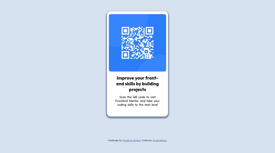


Design comparison

Community feedback
- @MelvinAguilarPosted almost 2 years ago
Hello 👋. Congratulation on successfully completing your first challenge 🎉 ! !
I have other recommendations regarding your code that I believe will be of great interest to you.
HTML 🏷️:
- Use semantic elements such as
<main>and<footer>to improve accessibility and organization of your page.
- Since this component involves scanning the QR code, the image is not a decoration. You must not use the background-image property to add the QR code image. Instead, use the
<img>tag to add the image. Use the background-image property only for decorative images that do not add any information to the page.
CSS 🎨:
- Avoid using
position: absoluteto center an element as it may result in overflow on some screen sizes. Instead, utilize the flexbox or grid layout for centering. Get more insights on centering in CSS here here 📘.
I hope you find it useful! 😄 Above all, the solution you submitted is great!
Happy coding!
Marked as helpful1 - Use semantic elements such as
- @HassiaiPosted almost 2 years ago
Replace<div class="container">with the main tag, <h2> with <h1> and <div class="attribution"> with the footer tag to fix the accessibility issues. click here for more on web-accessibility and semantic html
To center .container on the page using flexbox or grid, add min-height:100vh; display: flex; align-items: center: justify-content: center; or min-height:100vh; display: grid place-items: center to the body.
To center .container on the page using flexbox:
body{
min-height: 100vh;
display: flex;
align-items: center;
justify-content: center;
}
To center .container on the page using grid: body{ min-height: 100vh; display: grid; place-items: center; }For a responsive content which wont require a media query for this challenge, replace the width in .container with max-width and give it a fixed value. Reduce the max-widthvalue for it to be equivalent to the width of the design.
max-width:320px. there is no need tGive .pic a max-width of 100% instead of a width, reduce the margin values of the pic to 15px.
Use relative units like rem or em as unit for the padding, margin, width values and preferably rem for the font-size values, instead of using px which is an absolute unit. For more on CSS units Click here
Hope am helpful.
Well done for completing this challenge. HAPPY CODING
Marked as helpful1


Please log in to post a comment
Log in with GitHub
Join our Discord community
Join thousands of Frontend Mentor community members taking the challenges, sharing resources, helping each other, and chatting about all things front-end!
Join our Discord